スピーディーな制作と多彩な仕上げオプションが魅力の、ミュージアムクオリティなジークレー・キャンバスプリント。 ( 手描きの複製画を注文する デジタル画像販売へ切り替え)





























作品のオリジナル比率に合わせた、当店の規定サイズからお選びください。

特定のフレームやスペースに合わせて、ご自身でサイズを指定することも可能です。選択されたサイズが元の画像の比率と一致しない場合、作品をトリミングするか、鏡面反射または単色での塗りつぶしによって画像を拡張いたします。制作を開始する前に、ご確認用のデジタルモックアップをお送りいたします。
画面上のプレビューには、実際のトリミングや拡張は反映されませんのでご注意ください。最終的な構図を正確に確認できるのは、モックアップのみとなります。
カスタムサイズも承っておりますが、元の比率を維持するためには、あらかじめ用意されたリストからサイズを選択することをお勧めいたします。
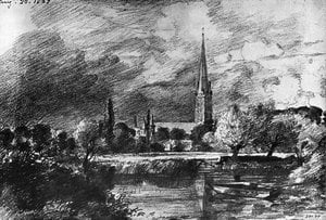
Self Portrait
複製画サイズ一覧
ジョン・コンスタブル作「Self Portrait」はパブリックドメイン(著作権消滅)です。このステータスは、作品の画像の複製方法を規定するものです。
ジョン・コンスタブル作「Self Portrait」に描かれた情緒はElegantであり、その感情的なトーンはReflectiveです。
ジョン・コンスタブル作「Self Portrait」の色彩表現:Gray (#817f82)を基調とした、Neutralsなパレット。
ジョン・コンスタブル作「Self Portrait」の似ている作品ページでは、関連する作品をご紹介しています。
「Self Portrait」は、Largeのプリントサイズでの印刷をおすすめします。他のサイズについても、同じ比率でご利用いただけます。
「Self Portrait」の彩度はMonochromaticです。彩度とは、色の鮮やかさの度合いを表します。
ジョン・コンスタブル作「Self Portrait」の色彩構成は、BoldなコントラストとSoftly Mixed Paletteな調和を併せ持っています。
ジョン・コンスタブル作「Self Portrait」の視覚的な明るさはbrilliantです。設置する空間の光の加減に合わせて調整することが可能です。


1776 - 1837 , イギリス

Explore the profound legacy of John Constable. Discover how his mastery of light, atmosphere, and the English landscape redefined Romanticism through timeless, museum-quality oil reproductions for discerning collectors.

Elevate your artistic practice with this expert guide to mastering the line. Discover advanced techniques in graphite, charcoal, and contour drawing designed for art students seeking technical precision and expressive depth in their fine art studies.

Explore the profound artistry of graphite drawing. Discover professional techniques for mastering depth, texture, and detail through a lens of art history, from classical sketches to modern masterpieces. Elevate your understanding of the pencil medium with our expert guide.

Discover the sophisticated mastery of graphite drawing. Explore expert techniques for achieving profound depth, intricate texture, and hyper-realistic detail through the alchemy of carbon, curated for the discerning art enthusiast and professional collector.

 設置イメージを確認
 送る
送る シェア
シェア
 詳細情報
詳細情報 ガイドを表示

 画像をダウンロード
 似ている作品
 X線調査
X線調査 スライドショー
 統計情報
統計情報
 続きを読む
続きを読む









 ガラスオプションは、110cm未満のサイズでのみご利用いただけます。