
x































作品のオリジナル比率に合わせた、当店の規定サイズからお選びください。

特定のフレームやスペースに合わせて、ご希望のサイズをご入力いただけます。選択されたサイズが元の画像の比率と異なる場合、アートワークをトリミングするか、手描きで要素を追加して絵画を拡張いたします。デジタルモックアップ を制作し、制作開始前にご確認(承認)をいただきます。
画面上のプレビューは、実際のトリミングや拡張を正確に反映しているものではありません。最終的な構図は、モックアップによってのみ正確にご確認いただけます。
カスタムサイズもご利用いただけますが、元の比率を維持するためには、あらかじめ用意されたリストからサイズを選択することをお勧めいたします。

Love letter 5
複製画のサイズ
Georges Braque’s “Love Letter 5,” a captivating abstract composition, isn't merely a painting; it’s an invitation into a realm of introspective emotion. Born in 1882 and a pivotal figure in the development of Cubism alongside Pablo Picasso, Braque consistently pushed the boundaries of artistic representation, moving beyond literal depiction to explore the very essence of form and color. This particular work, created around 1963 – a period marked by reflection and experimentation – embodies this ethos with remarkable intensity. The dominant palette of deep purples and muted greys immediately establishes a mood of quiet contemplation, a subtle melancholy that’s both alluring and unsettling. It's a space designed not to be easily deciphered, but rather felt.
The composition itself is a dynamic interplay of swirling curves and sharp angles. These elements aren’t arranged in a traditional manner; instead, they intertwine and overlap, creating a sense of movement and tension. The stylized star-like shapes scattered across the surface add to this complexity, suggesting fragments of memory or perhaps even glimpses into a fractured consciousness. Notice how Braque masterfully employs layering – a technique evident in the slightly uneven texture of the background – to build depth without relying on conventional perspective. This deliberate ambiguity invites the viewer to actively participate in constructing meaning, rather than passively receiving it.
While firmly rooted in Cubism’s principles of fragmented form and multiple viewpoints, “Love Letter 5” also carries echoes of Braque's earlier engagement with Fauvism. The bold, non-naturalistic colors – the rich purples and cool greys – recall the vibrant hues favored by Matisse and Derain, albeit filtered through a more restrained sensibility. This blending of influences is characteristic of Braque’s artistic evolution; he never clung rigidly to any single style but constantly absorbed and transformed elements from various movements.
The dry brushing technique employed in creating this piece contributes significantly to its textural richness. The visible brushstrokes, particularly evident in the mottled purple background, add a tactile quality that draws the viewer into the artwork. It’s as if you could reach out and feel the surface beneath your fingertips – a deliberate choice by Braque to emphasize the materiality of paint itself.
Beyond its formal qualities, “Love Letter 5” hints at deeper symbolic meanings. The recurring curves could represent cycles—birth, death, and rebirth—while the angular shapes might suggest disruption or fragmentation. The scattered star-like forms have been interpreted as fragments of memory, individual moments suspended in time. It’s important to note that Braque rarely offered explicit explanations for his work, preferring to allow viewers to draw their own conclusions. This ambiguity is precisely what makes “Love Letter 5” so compelling – it's a painting that speaks to the viewer on a deeply personal level.
WahooArt’s hand-painted reproductions capture the essence of Braque’s original vision with exceptional fidelity. We meticulously recreate the layering, texture, and nuanced color palette using only traditional techniques and archival-quality materials. This ensures that your reproduction will not only be a beautiful addition to your collection but also a lasting testament to the artistry of Georges Braque. “Love Letter 5” is more than just an image; it’s an experience—an invitation to contemplate the complexities of form, color, and emotion.

1882 - 1963 , フランス

Explore the profound depth of Cubist Expression. From the deconstructed forms of Picasso to Braque’s geometric mastery, discover how shattering reality through abstraction redefined modern art and continues to inspire sophisticated collectors worldwide.

Explore the profound evolution of Cubist still life, from Cézanne's structural foundations to the fragmented brilliance of Braque and Léger. Discover how geometric abstraction redefined reality through a sophisticated lens of form, color, and modern artistic mastery.
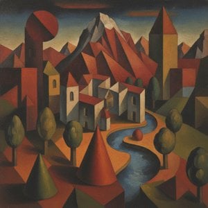
Explore the profound evolution of Cubist landscapes. Discover how masters like Braque and Picasso redefined perspective through geometric mastery, transforming nature into an intellectual mosaic of form and light for the discerning modern art collector.

Explore the profound spiritual depth of geometric abstraction. From Malevich's Suprematism to modern masters, our expert guide reveals how pure form and color command presence in fine art collections.

最新の美術ニュース、限定オファー、そしてインテリアのアイデアをいち早くお届けします。
お客様のプロジェクトについてお聞かせください。当社の美術専門家が、お客様に合わせた3つのパーソナライズされた芸術提案をご提供いたします。
あなたにぴったりの3作品を無料で厳選いたします


 プレビュー
プレビュー
 プリントを購入
 シェアする
シェアする シェアする
シェアする
 詳細を見る
詳細を見る

 ダウンロード
 似ている作品
 X線調査
X線調査 スライドショー
 詳細を見る
詳細を見る









 ガラスオプションは、110cm未満のサイズでのみご利用いただけます。


