

 PaintingWallArtOp Art
 Modern
 126.0 x 92.0 cm
 Abbot Hall Art Gallery
このページに掲載されている作品は著作権法によって保護されており、当社の許可なく同一の複製物を制作または販売することは法律で禁じられています。この保護は、以下のような国際条約に基づき執行されます。 ベルヌ条約 および、以下の条項に定められたものを含む各国の法律により、 米国著作権法 第17編。
この手法は、著作権で保護された作品の複製や複写を伴わないため、著作権法に完全に準拠しています。これは単なる模倣ではなく、創造的な再解釈です。元の作品からインスピレーションを受けつつも、それとは異なる、全く新しい絵画を生み出すものです。
スピーディーな制作と多彩な仕上げオプションが魅力の、ミュージアムクオリティなジークレー・キャンバスプリント。 ( 手描きの複製画を注文する デジタル画像販売へ切り替え)





























作品のオリジナル比率に合わせた、当店の規定サイズからお選びください。

特定のフレームやスペースに合わせて、ご自身でサイズを指定することも可能です。選択されたサイズが元の画像の比率と一致しない場合、作品をトリミングするか、鏡面反射または単色での塗りつぶしによって画像を拡張いたします。制作を開始する前に、ご確認用のデジタルモックアップをお送りいたします。
画面上のプレビューには、実際のトリミングや拡張は反映されませんのでご注意ください。最終的な構図を正確に確認できるのは、モックアップのみとなります。
カスタムサイズも承っておりますが、元の比率を維持するためには、あらかじめ用意されたリストからサイズを選択することをお勧めいたします。
Conversation
複製画サイズ一覧
To stand before Bridget Riley’s Conversation is to enter a realm where the boundaries between sight and sensation begin to dissolve. This mesmerizing masterpiece, created in 1992, serves as a profound testament to the artist's evolution from the stark, rhythmic black-and-white Op Art of her early career into a much more lush, chromatic exploration of perception. The painting is not merely a static arrangement of color; it is a living, breathing entity that seems to pulse with its own internal rhythm. As the eye wanders across the canvas, the intricate interplay of stripes and checkered patterns creates a kinetic energy, inviting the viewer into a silent dialogue between the retina and the mind.
The technique employed in Conversation is nothing short of architectural. Riley utilizes bands of complex, saturated colors—ranging from deep blues and vibrant yellows to earthy oranges and greens—arranged vertically to create a sense of depth and movement. However, it is the introduction of diagonal elements that truly transforms the work. These intersecting planes cut through the verticality, creating an illusion of overlapping layers that extend far beyond the physical surface of the linen. This layering effect mimics the way sound waves might overlap in a musical composition, much like the different sections of an orchestra playing in harmony, effectively turning a visual experience into a multisensory one.
Beyond its technical brilliance, Conversation is deeply rooted in the artist's personal history and global wanderings. This particular body of work was profoundly influenced by Riley’s travels through Egypt and India during the 1980s. The palette reflects a deep connection to the natural pigments and sun-drenched landscapes she encountered, moving away from the clinical precision of her earlier works toward something more organic and emotionally resonant. The colors do not just sit upon the canvas; they vibrate against one another, evoking the warmth of distant horizons and the complex textures of ancient terrains.
For the discerning collector or interior designer, this piece offers a unique opportunity to introduce a focal point of unparalleled sophistication. Conversation possesses a rare ability to command a room, acting as both a window into an abstract dimension and a source of meditative calm. Its rhythmic complexity provides a stimulating intellectual challenge, while its vibrant palette can breathe life and energy into a contemporary space. Whether placed in a minimalist gallery setting or a richly textured living area, a high-quality reproduction of this work brings with it the prestige of modern art history and the enduring magic of Bridget Riley’s visionary perception.
「Conversation」の色調は、Luminousの輝度を示しています。
ブリジット・ライリー作「Conversation」のプリントは、Landscapeの向きでLargeのサイズに印刷することをお勧めします。
「Conversation」では、BoldなムードにEnergeticな感情が添えられています。
ブリジット・ライリー作「Conversation」に記録された情緒的なトーンはEnergeticです。これは、作品が表現している感情を要約したものです。
「Conversation」はOp Artの様式に属しており、その作者は近代美術の時代に活動していました。
ブリジット・ライリー作「Conversation」の似ている作品ページでは、関連する作品をご紹介しています。
ブリジット・ライリー作「Conversation」のX線ビューは、作品のX線解析ページでご覧いただけます。11層の光学レイヤーを通じて画像をインタラクティブに解析できる、詳細な検証機能です。
「Conversation」の中で最も際立っている色はSteel Blue (#31add3)です。作品の主色(メインカラー)を知ることは、インテリアとのコーディネートを考える際に役立ちます。

1931 - , イギリス

Explore the profound world of optical art and masterpieces that redefine perception. From Vasarely’s geometric illusions to Farndon’s sensory reality, discover how legendary works challenge the eye and transform the viewer's experience through sophisticated abstraction.

Embark on a visual journey through the mesmerizing world of Op Art. Discover the masters of optical illusion, explore geometric abstraction, and learn how to curate high-impact kinetic works for your private collection with expert guidance from art professionals.
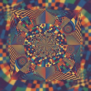
Explore the mesmerizing world of Victor Vasarely. Discover how his Bauhaus-inspired Op Art masters the science of perception through geometric abstraction and vibrant color. A sophisticated guide for discerning art collectors seeking to understand the legacy of optical illusion.
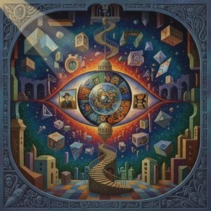
Embark on a visual journey through the world's most captivating illusions. From Trompe l'oeil realism to the geometric wonders of Op Art, explore how master artists manipulate perception and depth to create timeless masterpieces of optical wonder.

Embark on a visual journey through history's most captivating optical illusions. From Trompe l'oeil to Op Art, explore the masterpieces that challenge perception and redefine reality in the world of fine art.

 設置イメージを確認
 送る
送る シェア
シェア
 詳細情報
詳細情報 ガイドを表示

 画像をダウンロード
 似ている作品
 X線調査
X線調査 スライドショー
 統計情報
統計情報 続きを読む
続きを読む









 ガラスオプションは、110cm未満のサイズでのみご利用いただけます。


