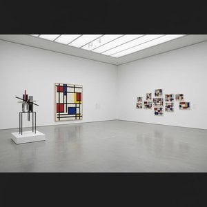
Piet Mondrian élete és művészete: A geometriai absztrakció úttörője
Pieter Cornelis Mondriaan néven született 1872-ben a csendes holland városban, Amersfoortban. Mondrian művészi útja nem volt azonnali megvilágosodásé, hanem egy fokozatos kibontakozás folyamata. Korai éveit a hagyományok határozták meg; nagybátyja, Frits Mondriaan már ismert festő volt, és ez a családi kapcsolat kezdetben a tájképfestés felé terelte. Ezek az első alkotások, melyek emlékeztetnek a Hágai Iskolára és a holland impresszionizmusra – például *A vörös malom* – egy fiatal művészt mutatnak be, aki szorgalmasan tanulmányozza a természetet, elsajátítja a technikákat, de finoman keres valami mást, mint a puszta ábrázolást. Már akkor érezhető volt az egyszerűsítésre való vágy, amely ecsetvonásait vonzotta. Nem elégedett meg a világ merev tükrözésével; lényegét akarta megragadni. Ez a korai időszak kísérletezéssel telt – pontillizmussal és fauvizmussal is próbálkozott, mindegyik stílus más perspektívát kínált a szín és a forma megtekintésére, de egyik sem elégítette ki növekvő művészi látásmódját. Ez az időszak felfedezés ideje volt, egy szükséges előjáték ahhoz a radikális változáshoz, amely örökségét meghatározta.
A párizsi ébredés és a Neoplasticizmus születése
Kulcsfontosságú pillanat következett be 1912-ben, amikor Mondrian Párizsba költözött. A város avantgárd energiával lüktetett, és ő elmerült a forradalmi kubizmus világában. Ez a találkozás sorsfordító volt. Megkezdte az alakzatok dekonstruálását, tárgyakat bontott szét geometriai elemeikre, eltávolodva attól, hogy *mit* látott, és inkább arra koncentrált, hogyan látta azt. De Mondrian nem egyszerűen egy új stílust alkalmazott; spirituális útra indult. A teozófiára – egy misztikus filozófiára, amely a mögöttes univerzális elveket hangsúlyozza – mélyen hatva hitt abban, hogy a művészet jármű lehet ezeknek a rejtett igazságok kifejezésére. Ez a hit hajtotta szüntelen törekvését az absztrakcióra, és arra ösztönözte, hogy a színeket és formákat a legősibb elemeikre redukálja. Körülbelül 1917-ben ez a folyamat csúcsosodott ki a Neoplasticizmus megfogalmazásában, amelyet gyakran ‘tiszta plasztikai művészetnek’ neveztek. Ez egy radikális esztétika volt, amely alapvető formákon – egyenes vonalakon, derékszögeken – és korlátozott palettán alapozt: elsődleges színeken (piros, kék, sárga), feketén, fehérben és szürkében. Mondrian számára ez a redukció nem ürességet jelentett; az univerzum mögöttes harmóniájának felfedezéséről szólt, a spirituális rend vizuális megnyilvánulásáról. Theo van Doesburg-gal közösen alapította a *De Stijl* mozgalmat ezeknek az ötletek népszerűsítésére, megerősítve ezzel a Neoplasticizmus meghatározó szerepét a modern művészetben. Mesterei alkotásai, mint például *Kompozíció pirossal, kékkel és sárgával* és *Tableau no. 2 Kompozíció no. V*, tanúskodnak erről az időszakról, ikonikus ábrázolások a geometriai tisztasághoz való töretlen elkötelezettségéről.
New York ritmusai: Kései életben virágzás
A második világháború kitörése kényszerítette Mondriant 1940-ben Európa elhagyására, és menedéket talált New York City nyüzsgő metropoliszában. Ez a költözés váratlanul élénkítőnek bizonyult. A város merev rácsszerkezete – éles ellentét a korábban ismert organikus tájakkal – rezonált művészi elveivel. Kései munkái, legnevezetesebben a *Broadway Boogie Woogie* (1943), tükrözik ezt a hatást. Miközben megőrizte a Neoplasticizmus alapelveit, a festmény dinamikus energiát vezet be, egy vibráló ritmust, amelyet a város lüktető élete és a jazz zene inspirált. Az egyenes vonalak még mindig jelen vannak, de most szabadabban táncolnak és metszik egymást, mozgás- és örömérzetet teremtve. Mintha Mondrian új nyelvet talált volna a beépített szókincsén belül, egy módot arra, hogy az egyszerű geometriai absztrakció segítségével kifejezze a modern városi élet komplexitását. Haláláig finomította stílusát 1944-ben, és hagyott maga után egy olyan munkásságot, amely továbbra is lenyűgöz és inspirál.
Tartós örökség: Mondrian maradandó hatása
Piet Mondrian hatása a művészet világára felmérhetetlen. Ő nem csupán egy művész volt; egy víziós, aki gyökeresen megváltoztatta az absztrakció és annak univerzális igazságok kifejezésére való képességének megértését. Munkája mélyen befolyásolta számos művészt, mozgalmat és tudományterületet. Az Absztrakt Expresszionizmus, a Minimalizmus és a Színmező festészet mind kötelezi magát úttörő szellemének. De hatása messze túlmutat a vásznon. A Neoplasticizmus elvei – egyszerűség, tisztaság, geometriai rend – áthatották az építészetet, a dizájnt és a divatot. A bútoroktól és textíliáktól kezdve az épületek homlokzatain át a grafikai tervekig Mondrian esztétikája továbbra is formálja vizuális világunkat. Ő ikonikus alak marad a modern művészetben, az absztrakció töretlen keresésének és a művészet átalakító erejének szimbóluma. Ahogy Stephen Bayley dizájntörténész találóan megjegyezte, Mondrian “totémévé vált mindannak, amit a modernizmus megvalósítani kívánt.” Öröksége nem csupán esztétikai szépség öröksége, hanem intellektuális szigor, spirituális mélység és a művészet átalakító erejébe vetett töretlen hit öröksége.
Hatások és kulcsfontosságú alkotások
- Korai hatások: A Hágai Iskola, a holland impresszionizmus, a pontillizmus, a fauvizmus megalapozták kezdeti művészi felfedezéseit.
- Átformáló hatás: Párizsi kubizmus kulcsfontosságú volt az absztrakció és a geometriai formák felé való elmozdulásában.
- Filozófiai alap: A teozófia mélyen befolyásolta azt a hitét, hogy a művészet kifejezheti az univerzális spirituális elveket.
- Kulcsfontosságú alkotások: *A vörös malom* (korai naturalista időszak), *Kompozíció pirossal, kékkel és sárgával* (quintesszenciális Neoplasticizmus), *Tableau no. 2 Kompozíció no. V* (demonstrálja az alapvető formákra való redukciót), *Broadway Boogie Woogie* (kései életben dinamizmus, amelyet New York City inspirált).
- Tartós hatás: Mondrian munkája továbbra is inspirál



 Előnézet
 Kézzel festett másolat vásárlása
 Megosztás
 Megosztás
 Részletek
 Útmutató

 Letöltés
 Hasonló darabok
 X-ray felvétel
 Diavetítés
 Statisztika


 Tovább olvasom






































 Az üvegkeretes opció csak 110 cm alatti méretben érhető el