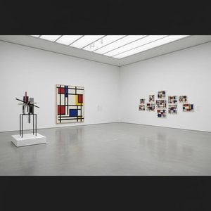
Arhitekt Apstrakcije: Život u Geometrijskoj Harmoniji
Theo van Doesburg, rođen Christian Emil Marie Küpper 1883. godine u Utrechtu, Nizozemska, bio je više od slikara; on je bio revolucionarna sila koja je preoblikovala same temelje moderne umjetnosti. Njegovo putovanje započelo je u odjeku impresionizma i postimpresionizma, isprva odražavajući stilove podsjetljive na Vincenta van Gogha – kako po temi tako i po emocionalnom intenzitetu. Međutim, ova rana faza poslužila je kao ključni predigra, nužan korak prema radikalnoj transformaciji koja će definirati njegov trajni nasljeđe. Ključni trenutak nastupio je 1913. godine s njegovim susretom s Wassily Kandinskyjevim djelom *Rückblicke*. Ovaj tekst probudio je u van Doesburgu duboko uvjerenje: istinska umjetnička ekspresija ne leži u replikaciji vanjskog svijeta, već u usmjeravanju unutarnje, duhovne stvarnosti kroz čistu apstrakciju. Iz tog je uvjerenja rođen Neoplasticizam, poznatiji kao De Stijl – pokret koji je osnovao i žarko branio, postajući njegov najstrastveniji zagovornik.
Kovanje Novog Vizualnog Jezika: Principi De Stijla
De Stijl nije bio samo umjetnički stil; to je bio sveobuhvatni filozofski manifest prenesen u vizualan oblik. Van Doesburg vjerovao je u svodenje umjetnosti na njezine najbitnije elemente – ravne linije, prave kutove i primarne boje crvene, žute i plave, uz crnu, bijelu i sivu. Ova stroga paleta nije rođena iz ograničenja, već iz želje za univerzalnošću – uvjerenja da su ti temelji oblici rezonirali s dubokim kozmičkim redom. Zamislio je *totalno* umjetničko djelo koje se proteže izvan platna kako bi obuhvatilo arhitekturu, dizajn i čak svakodnevne predmete. Suradnja je bila ključna; van Doesburg je blisko surađivao s arhitektima poput J.J.P. Ouda i Gerrita Rietvelda, dizajnirajući vitralna stakla, namještaj i čitave interijere koji su utjelovljivali principe De Stijla. Njegove suradnje protezale su se na umjetnike kao što je Piet Mondrian, s kojim je pokrenuo utjecajan časopis *De Stijl*, platformu za širenje njihovih ideja i privlačenje istomišljenika. Međutim, unatoč zajedničkom podrijetlu, napetosti su nastale između van Doesburga i Mondriana u vezi krutosti Neoplasticizma. Van Doesburg je 1926. godine uveo “Elementarizam”, zagovarajući dijagonalne linije i dinamičnije kompozicije – odstupanje koje je na kraju dovelo do raskola unutar pokreta, otkrivajući njegov nemirni duh i stalnu potragu za umjetničkom evolucijom.
Izvan Slikarstva: Višestruka Umjetnička Vizija
Iako slavljen kao slikar, van Doesburgovi su se umjetnički pothvati bili iznimno raznoliki. Bio je plodan pisac, pjesnik i kritičar, koristeći pero kako bi artikulirao teorijske osnove De Stijla i osporio konvencionalne predodžbe o umjetnosti. Njegovo angažman s Dadaizmom ranih 1920-ih dodatno je proširio njegove umjetničke horizonte, što je dovelo do eksperimentalnih radova koji su uključivali kolaže i tipografiju. Tijekom tog razdoblja predavao je i na Bauhausu, gdje je podijelio svoje ideje s novom generacijom umjetnika i dizajnera. Nije bio zadovoljan ostankom unutar okvira tradicionalnih umjetničkih oblika; van Doesburg je aktivno nastojao integrirati umjetnost u svakodnevni život, vjerujući da ima moć transformirati društvo. Njegovi su dizajn interijera i namještaja bili više od estetskih vježbi, već pokušaji stvaranja harmoničnih stambenih prostora koji su odražavali principe De Stijla. Izvanredan je primjer njegova suradnja sa Sophie Taeuber-Arp i Georgesom Vantongerloom u dizajniranju umjetničkih rezidencija, pokazujući holistički pristup kreativnosti – pokušaj izgradnje svijeta *u* slici njegovih ideala.
Nasljeđe i Trajni Utjecaj: Pionir Modernizma
Život Thea van Doesburga tragično je prekinut 1931. godine u dobi od 47 godina, no njegov utjecaj na modernu umjetnost ostaje dubok. De Stijl, iako relativno kratkotrajan kao koherentan pokret, izvršio je ogroman utjecaj na naknadne umjetničke razvoj, uključujući dizajn Bauhausa, Minimalizam i Konstruktivizam. Njegov naglasak na geometrijskoj apstrakciji, čistoj boji i funkcionalizmu nastavlja odjekivati s umjetnicima i dizajnerima danas. Njegovo djelo služi kao podsjetnik da umjetnost nije samo o reprezentaciji, već o istraživanju temeljnih oblika i ideja. Nasljeđe van Doesburga proteže se izvan njegovih slika i dizajna; leži u njegovoj nepokolebljivoj predanosti umjetničkoj inovaciji i uvjerenju u transformativnu moć apstrakcije. Njegova vizija ujedinjenog, harmoničnog svijeta – izraženog jezikom De Stijla – nastavlja inspirirati one koji teže stvaranju ljepšeg i smislenijeg okruženja.
Ključna Djela & Trajni Utjecaj
- Studija za Simultane Kompozicije XXII (1922): Izvanredan primjer Neoplasticizma, koji pokazuje potpisne geometrijske oblike i ograničenu paletu boja pokreta.
- Kompozicija s polutonovima (1928): Demonstrira van Doesburgovo istraživanje tonskih varijacija unutar estetike De Stijla.
- Plesači (1917-1918): Predstavlja prijelaznu fazu u njegovom radu, spajajući figurativne elemente s novim apstraktnim tendencijama.
- Suradnja na časopisu *De Stijl* : Ključna platforma za širenje ideja pokreta i poticanje dijaloga među umjetnicima i intelektualcima.
- Elementarizam (1926): Van Doesburgov pokušaj ubrizgavanja dinamike u Neoplasticizam, uvodeći dijagonalne linije i fluidniji pristup kompoziciji.
Van Doesburgov utjecaj može se vidjeti u bezbrojnim aspektima modernog dizajna – od arhitekture i namještaja do grafičkog dizajna i tipografije. Ostaje ključna figura u povijesti umjetnosti, istinski pionir koji se usudio izazvati konvencije i zamisliti novi vizualni jezik za 20. stoljeće i dalje – nasljeđe utisnuto ravnim linijama i primarnim nijansama.



 Pregledaj u stvarnoj veličini
 Prebacite na prodaju printova
 Podijeli
 Podijeli
 Detalji
 Vodič
Vodič

 Preuzmi datoteku
 Slični predmeti
 Rentgenska snimka
 Slide show
 Statistika

 Pročitajte više






































 Opcija stakla dostupna je samo za dimenzije manje od 110 cm