A Snapshot of Urban Life: Unveiling "Julia Reading"
William James Glackens’ “Julia Reading,” painted in 1916, isn't merely a portrait; it’s a meticulously crafted window into the burgeoning dynamism and subtle social currents of early 20th-century New York City. Born during the height of the Ashcan School movement, Glackens rejected the idealized depictions favored by the National Academy of Design, instead choosing to capture the gritty reality of everyday life – the bustling streets, the casual interactions, and the quiet moments within a rapidly changing metropolis. “Julia Reading” exemplifies this approach, offering a glimpse into a specific scene that simultaneously feels intimate and profoundly connected to the larger urban narrative.
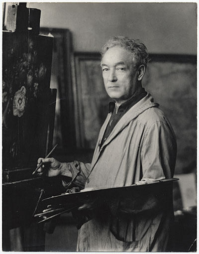
The painting immediately draws the eye to its central figure, a woman engrossed in a book. Her posture – slightly turned towards the viewer, her hand resting delicately on the page – conveys a sense of quiet contemplation amidst the implied activity around her. Glackens’ masterful use of light and shadow establishes a strong focal point, directing our gaze to Julia's face and highlighting the subtle details of her expression. The inclusion of two other individuals—a man standing behind her and another seated further back—adds layers of narrative complexity without disrupting the primary focus. These figures, though less defined, contribute to the sense of a shared space, a moment captured within the larger tapestry of urban life.
The Ashcan School: A Rejection of Tradition
Glackens was a key figure in the Ashcan School, a movement that challenged the established norms of American art. Rejecting the polished surfaces and grand narratives of academic painting, the Ashcan artists sought to depict the realities of urban life with honesty and immediacy. They favored working-class subjects, unvarnished scenes, and often employed a darker palette—a deliberate choice reflecting the sometimes bleak conditions of city living. “Julia Reading” embodies this spirit perfectly; it’s not a romanticized vision of New York, but rather a realistic portrayal of a woman finding solace in literature within its crowded streets.
The painting's style is characterized by loose brushstrokes and an emphasis on capturing the essence of the scene. Glackens employed a technique reminiscent of Impressionism, using broken color and subtle gradations to create a sense of movement and atmosphere. The composition itself—a slightly off-center arrangement with overlapping planes—adds to the painting’s dynamism and invites the viewer to become part of the scene.
Symbolism and Context: A Moment in Time
The book Julia is reading likely symbolizes escape, knowledge, or perhaps simply a moment of respite from the demands of city life. It's a small detail that speaks volumes about the human desire for intellectual stimulation amidst the chaos of urban existence. The setting itself—a public space filled with implied activity—suggests a sense of anonymity and connection within a large population. “Julia Reading” was painted during a period of rapid industrialization and urbanization in America, a time of significant social and economic change. The painting reflects this transformation, capturing the spirit of a city grappling with modernity while still retaining its inherent human qualities.
A Legacy of Realism: Glackens' Enduring Influence
William James Glackens’ work continues to resonate today because it offers a powerful and honest portrayal of American life. “Julia Reading” stands as a testament to his skill as an artist and his commitment to capturing the realities of the urban experience. His legacy extends beyond individual paintings; he helped pave the way for future generations of artists who sought to depict America with greater authenticity and social awareness. Reproductions of this evocative piece offer a valuable window into a bygone era, inviting viewers to contemplate the timeless themes of human connection, solitude, and the enduring power of art.
Questions et réponses
Quelle est l'intensité des couleurs de «Julia Reading» de William James Glackens ?
L'intensité des couleurs de « Julia Reading » est Balanced. L'intensité décrit la force avec laquelle les couleurs apparaissent.
Quelle couleur domine la composition de «Julia Reading» de William James Glackens ?
La couleur dominante de «Julia Reading» de William James Glackens est le Espresso (#382428).
Comment puis-je visionner «Julia Reading» de William James Glackens sous forme de diaporama ?
Vous pouvez visionner «Julia Reading» de William James Glackens sous forme de diaporama sur la page Diaporama de l'œuvre.



 Aperçu en situation
 Acheter la peinture faite à la main
 Partager
 Partager
 Détails
 Guide imprimable

 Télécharger
 Articles similaires
 Radiographie
 Voir le diaporama
 Statistiques


 Afficher la suite






































 L'option verre n'est disponible que pour les dimensions inférieures à 110 cm.


