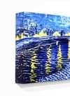
Eelvaade AR-eelvaade Osta käsitsi maalatud teos Lülita digitaalse pildi juurde Saada
Teave teose kohta Juhend Lisa lemmikutesse Laadi alla Sarnased teosed Röntgenuuring Slaidietendus KÜSIMUSED JA VASTUSID Esitlus Statistika

Composition

Mõõtmed
41.0 x 33.0 cm

A balanced grid of primary red, blue, and yellow rectangles against black and white, reflecting a search for cosmic order in 1923.

De Stijli hollandi pioneer, kes kasutas põhivõre ja geomeetrilist abstraktsiooni, et luua sirgete joonte ja täisnurkadega dünaamilisi kompositsioone.

Giclée / Kunstiprint

Muuseumikvaliteediga giclée- või kangasprint kiire tootmisega ja paindlikud viimistlusvõimalused. ( Osta käsitsi maalatud teos Lülita digitaalse pildi juurde)
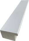
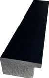
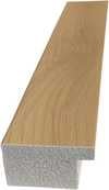
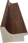
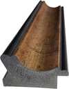
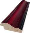
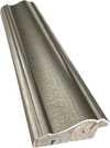
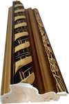
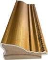
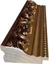
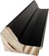
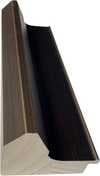
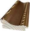
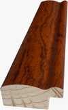
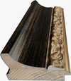
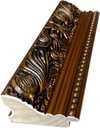
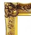
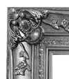
Corner sample of the P118B picture frame: vormitud polüstüreen, 5 cm wide and 3 cm thick
P118B €10
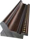
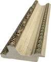
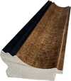
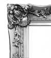
Corner sample of the P118H picture frame: vormitud polüstüreen, 5 cm wide and 3 cm thick
P118H €10
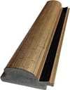
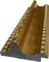
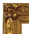
Corner sample of the P118W picture frame: vormitud polüstüreen, 5 cm wide and 3 cm thick
P118W €10
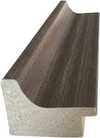
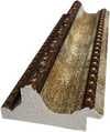
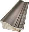
Corner sample of the P438Z picture frame: vormitud polüstüreen, 5.5 cm wide and 3.5 cm thick
P438Z €10
Corner sample of the P508JH picture frame: vormitud polüstüreen, 7 cm wide and 3.5 cm thick
P508JH €12
Corner sample of the P508YH picture frame: vormitud polüstüreen, 7 cm wide and 3.5 cm thick
P508YH €12
Corner sample of the P805H picture frame: vormitud polüstüreen, 5 cm wide and 3.5 cm thick
P805H €10
Corner sample of the P805Z picture frame: vormitud polüstüreen, 5 cm wide and 3.5 cm thick
P805Z €10
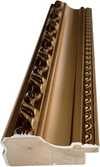
Corner sample of the P919BZ picture frame: vormitud polüstüreen, 7 cm wide and 3.5 cm thick
P919BZ €10
Corner sample of the P919G picture frame: vormitud polüstüreen, 7 cm wide and 3.5 cm thick
P919G €10
Corner sample of the P919XJ picture frame: vormitud polüstüreen, 7 cm wide and 3.5 cm thick
P919XJ €10
Corner sample of the P959ZH picture frame: vormitud polüstüreen, 5 cm wide and 3 cm thick
P959ZH €10
Corner sample of the P968JZ picture frame: vormitud polüstüreen, 6 cm wide and 4 cm thick
P968JZ €12
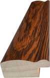
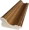
Corner sample of the W106C picture frame: massivpuit, 5 cm wide and 3 cm thick
W106C €8
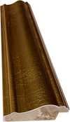
Corner sample of the W218G picture frame: massivpuit, 5 cm wide and 3 cm thick
W218G €10
Corner sample of the W218JH picture frame: massivpuit, 5 cm wide and 3 cm thick
W218JH €8
Corner sample of the W218Y picture frame: massivpuit, 5 cm wide and 3 cm thick
W218Y €10
Corner sample of the W307PJ picture frame: massivpuit, 6 cm wide and 3 cm thick
W307PJ €10
Corner sample of the W316G picture frame: massivpuit, 6 cm wide and 3 cm thick
W316G €10
Corner sample of the W316PJ picture frame: massivpuit, 6 cm wide and 3 cm thick
W316PJ €8
Corner sample of the W316Y picture frame: massivpuit, 6 cm wide and 3 cm thick
W316Y €10
Corner sample of the W398PJ picture frame: massivpuit, 5 cm wide and 3 cm thick
W398PJ €8
Corner sample of the W4111J picture frame: massivpuit, 6.5 cm wide and 3.5 cm thick
W4111J €10
Corner sample of the W500HY picture frame: massivpuit, 7 cm wide and 5 cm thick
W500HY €15
Corner sample of the W500JH picture frame: massivpuit, 7 cm wide and 5 cm thick
W500JH €15
Corner sample of the W692G picture frame: massivpuit, 8 cm wide and 4 cm thick
W692G €12
Corner sample of the W849H picture frame: massivpuit, 5 cm wide and 3 cm thick
W849H €8
Corner sample of the W940BG picture frame: massivpuit, 7.5 cm wide and 4.5 cm thick
W940BG €15
Corner sample of the W953PJ picture frame: massivpuit, 6 cm wide and 3.5 cm thick
W953PJ €8

Standardne suurus
kohandatud
CM
INCH

Vali meie eelmääratud suurused, mis vastavad teose algupärastele proportsioonidele.

laius
kõrgus

Sisestage vajalik laius ja kõrgus, et see sobiks teie raamile või seinale. Trükki saab ainult lõigata, seda ei saa kunagi pildist suuremaks teha, seega ka erineva mustega suurus kaotab osa pildist. Enne trükkimist saadame teile kinnitamiseks digitaalse näidisprojektsiooni. Sellel lehel näidatud pilt ei kujuta reaalset lõiget — seda näitab ainult näidisprojektsioon.

Ülemaailmne tarne () 2 nädala jooksul, tavalise 4/5 nädala asemel. (25 november)

Tasuta ekspresssaatmine üle maailma
Kõrgekvaliteediline lina-kangas
Täielik transpordikindlustus
Tollimaksude tagastamise garantii
Värvitoime täpsuse garantii
100 päeva tagastusõigus (ainult valmistusdefektide korral)
100% raha tagasi garantii
Hulgusoodustus

Kogu summa

€ 62

Composition

Giclée / Kunstiprint

Reproduktsiooni suurus

-

Koguhind

€ 62

Teave teose kohta

  • Dimensions: 41 x 33 cm
  • Movement: De Stijl
  • Notable elements or techniques: Grid-like arrangement, vertical and horizontal lines
  • Artist: Theo van Doesburg
  • Title: Composition

Kunstiteaduse kvartett

Iga küsimuse kohta on ainult üks õige vastus.

Küsimus 1:
What is the primary artistic style of the painting 'Composition'?
Küsimus 2:
In which year was the artwork 'Composition' created?
Küsimus 3:
Which movement did Theo van Doesburg found?
Küsimus 4:
What are the primary colors used in the painting's composition?
Küsimus 5:
What is the size of the painting?

Identification of Composition by Theo van Doesburg

The canvas known as Composition emerges from the mind of Theo van Doesburg, a work that captures a specific moment in 1923. This piece exists as a precise arrangement of form and color, born from a period of intense creative focus. The artist, Theo van Doesburg, brings a sense of equilibrium to the surface, translating abstract thought into a tangible presence. It is a work that demands attention through its structural clarity and its commitment to the principles of the De Stijl movement.

The history of this object is tied to a specific circle of thinkers and patrons. Antony Kok commissioned the work, setting it on its path through the hands of those who shaped the modern era. From there, the painting finds its way into the hands of Bart de Ligt (1883–1938), who becomes its first owner. This transition marks the beginning of a long lineage of stewardship, as the work moves from the artist's studio into a private collection where its presence remains constant.

Every line and color choice within Composition reflects the artist's pursuit of a universal visual language. As we observe the work, we see the direct result of a vision that seeks to strip away the unnecessary to find a fundamental truth. The painting remains a vital part of the history of abstraction, holding the weight of its 1923 origins in every carefully placed rectangle and primary hue.

Visual Composition and Geometric Elements

The canvas unfolds as a precise grid of rectangles, where vertical and horizontal lines intersect to dictate the movement of the eye. There is a profound sense of equilibrium achieved through this arrangement, as non-representational forms find their place within a structured, rhythmic order. The eye moves across the surface, guided by the intersections of these straight lines, finding balance in the way the shapes occupy the space. It is a study in pure geometry, where the subject matter is stripped of any external reference, leaving only the essence of form and relation.

Color acts as the primary force within this structured environment. The palette relies on the fundamental strength of red, yellow, and blue, which anchor the composition. These primary hues interact with a supporting cast of black, white, and grey, creating a tension between the boldest tones and the more neutral shades. The colors appear solid and flat, avoiding any blending or shading, which emphasizes the stark, clean nature of the geometric arrangement. Each rectangle holds its own weight, contributing to a visual language that seeks a universal harmony through simplicity.

Provenance and History of the Object

The history of this work begins in the creative atmosphere of Paris, where it finds its way from the artist's studio into the hands of Bart de Ligt. This acquisition likely occurs in late 1923, marking the start of a long and steady lineage. De Ligt, a man deeply connected to the avant-garde circles of the time, holds the piece within his personal collection until his passing in 1938.

From that moment, the painting enters a quiet, private chapter. It remains within the same family, passing through the hands of descendants for nearly a century. This continuity preserves the work's integrity, keeping it sheltered within a single domestic line since 1923. The colors and forms remain as they were when they first left the artist's side, held in a state of careful preservation through the decades.

Documented Interpretations and Artistic Debates

The canvas captures a moment of profound transition, acting as a key work within the artist's entire oeuvre. It reveals a growing complexity within his purist style, where the rigid logic of geometry begins to dance with a more nuanced sense of equilibrium. One senses the tension between the absolute and the evolving, as the lines and colors find a new, sophisticated rhythm. This evolution suggests a mind moving beyond simple shapes toward a more intricate visual language.

A deep connection between the realm of architecture and the act of painting pulses through the work. The composition feels less like a mere arrangement of pigment and more like a blueprint for a structured reality. This link is no accident; the artist himself articulated the concept behind its creation in the magazine Architectura on 17th July 1923. The painting exists as a bridge, where the spatial logic of built environments meets the spiritual pursuit of pure abstraction.

Related Works by the Same Artist

The evolution of this geometric language unfolds through several other pieces that trace the artist's shifting focus. One can look back to Composition XX from 1920 to see the early movements of these shapes. Nearby in the timeline, the 1923 work Study for a Composition offers a glimpse into the creative process behind these structured arrangements. These works exist as part of a continuous search for balance and order within the frame.

As the years progress, the compositions grow more complex and dynamic. The 1925 Counter composition XIV introduces a different energy to the grid. Later, the Simultaneous Counter-Composition from 1929–1930 pushes the boundaries of the aesthetic even further. Each piece captures a specific moment in a lifelong pursuit of a new visual language, moving from the rigid to the more fluid and experimental.

Korduvad küsimused

Millist meeleheust väljendab teos „Composition“, autor Theo Van Doesburg suunatud stiilis De Stijl?

Teose "Composition" Tranquil tunne on ühtne selle De Stijl stiiliga.

Millal ja millistest materjalidest on teos "Composition" valmistatud?

Teos "Composition" valmis aastal 1923, kasutades Oil On Canvas tehnikat. Materjal ja kuupäev kirjeldavad, kuidas ja millal originaal on valminud.

Kuidas seda teost „Composition“, autor Theo Van Doesburg saab kasutada kodukujunduses?

Teost "Composition" on soovitatav kasutada Geometry jaoks ning selleks soovitellav ruum on Office.


Kunstniku elulugu

Abstraktse Arhitekt: Elu Geomeetrilises Harmoonias

Theo van Doesburg, sündinud Christian Emil Marie Küpperina 1883. aastal Utrechtis Hollandis, ei olnud pelgalt maalikunstnik; ta oli revolutsiooniline jõud, mis muutis põhjalikult kaasaegse kunsti aluseid. Tema teekond algas muljetavaldavate ja post-muljetavaldavate kajade keskel, peegeldades esialgu stiile, mis meenutasid Vincent van Goghi loomingut – nii tema teemade kui ka emotsionaalse intensiivsuse poolest. Kuid see varajane etapp oli oluline eeltingimus, vajalik samm radikaalseks muundumiseks, mis määratleks tema püsiva legendi. Pöördepunkt saabus 1913. aastal kohtumisega Wassily Kandinsky teosega *Rückblicke*. See tekst sütitas van Doesburgis sügava arusaama: tõeline kunstiline väljendus ei seisne välist maailma kopeerimises, vaid sisemise vaimse reaalsuse kanaliseerimises puhta abstraktsiooni kaudu. Just sellest veendumusest sündis Neoplastitsism, tavalisemalt tuntud kui De Stijl – liikumine, mille ta asutas ja ägedasti propageeris, saades selle kõige innukamaks pooldajaks.

Uue Visuaalse Keele Loomine: De Stijli Printsiiibid

De Stijl ei olnud pelgalt kunstiline stiil; see oli terviklik filosoofiline manifest, mis tõlgiti visuaalsesse vormi. Van Doesburg uskus kunsti viimistlemises selle kõige olulisemate elementideni – sirgete joonte, täisnurkade ja punase, kollase ja sinise põhivärvidega, koos musta, valge ja halliga. See austere palett ei sündinud piirangutest, vaid soovist universaalsuse järele – uskumusest, et need põhilisemad vormid resonantsisid alusleva kosmose korraga. Ta nägi *terviktööd*, mis ulatub lõuendi väljast arhitektuuri, disaini ja isegi igapäevaste esemete juurde. Koostöö oli võtmetähtis; van Doesburg töötas tihedalt arhitektidega nagu J.J.P. Oud ja Gerrit Rietveld, kujundades vitraažakendeid, mööblit ja terveid interjööre, mis kehastasid De Stijli printsiipe. Tema koostöö laienes ka teistele kunstnikele, näiteks Piet Mondrianile, kellega ta asutas mõjukat ajakirja *De Stijl*, platvormi oma ideede levitamiseks ja sarnameelsete loovate inimeste meelitamiseks. Kuigi neil oli ühine algus, tekkisid van Doesburgi ja Mondriani vahel pinged Neoplastitsismi jäikuse osas. 1926. aastal tutvustas van Doesburg “Elementarismi”, propageerides diagonaalseid jooni ja dünaamilisemaid kompositsioone – lahknevust, mis viis lõpuks liikumise killustumisele, paljastades tema rahutu vaimu ja pideva kunstilise evolutsiooni otsingu.

Väljaspool Maalimist: Mitmekülgne Kunstiline Visioon

Kuigi teda tähistati maalikunstnikuna, olid van Doesburgi kunstilised püüdlused tähelepanuväärselt mitmekesised. Ta oli viljakas kirjanik, luuletaja ja kriitik, kasutades oma sulge De Stijli teoreetiliste aluste artikuleerimiseks ja traditsiooniliste kunsti arusaamade väljakutsumiseks. Tema kaasamine Dadaismi alguses 20. sajandi alguses laiendasid tema kunstilisi horisonte veelgi, viies eksperimentaalsete töödeni, mis sisaldasid kollaaži ja tüpograafiat. Sel perioodil õpetas ta ka Bauhausi, kus jagas oma ideid uue põlvkonna kunstnike ja disaineritega. Ta ei olnud rahul traditsiooniliste kunstivormide piiridega; van Doesburg otsis aktiivselt kunsti integreerimist igapäevaelu, uskudes selle võimet ühiskonda muuta. Tema sisekujunduse ja mööblidisainid polnud pelgalt esteetilised harjutused, vaid katsed luua harmoonilisi eluruume, mis peegeldasid De Stijli printsiipe. Hea näide on tema koostöö Sophie Taeuber-Arpiga ja Georges Vantongerlooga kunstnike elukohtade kujundamisel, mis demonstreeris holistilist lähenemist kunstilisele loomingule – katset ehitada maailma *oma ideaalide järgi*.

Pärand ja Püsiv Mõju: Modernismi Pioneer

Theo van Doesburgi elu katkestati tragiliselt 1931. aastal 47-aastaselt, kuid tema mõju kaasaegsele kunstile on sügav. De Stijl, kuigi suhteliselt lühiealine ühtse liikumisena, avaldas tohutut mõju järgnevatele kunstilistele arengutele, sealhulgas Bauhausi disainile, Minimalismile ja Konstruktivismile. Tema rõhk geomeetrilisel abstraktsioonil, puhtal värvil ja funktsionalismil on tänaseni resonantsis kunstnike ja disaineritega. Tema töö on meeldetuletus sellest, et kunst ei seisne pelgalt representatsioonis, vaid põhilisemate vormide ja ideede uurimises. Van Doesburgi pärand ulatub tema maalide ja kujunduste väljast; see peitub tema vankumas kompromissitus kunstilises innovatsioonis ja uskumuses abstraktsiooni muundumisvõimes. Tema visioon ühtse, harmoonilise maailma kohta – väljendatud De Stijli keeles – jätkab inspireerides neid, kes otsivad ilusamat ja tähenduslikumat keskkonda.

Põhitööd & Püsiv Mõju

  • Study for Simultaneous Compositions XXII (1922): Tüüpiline näide Neoplastitsismist, mis demonstreerib liikumise allkirjatud geomeetrilisi vorme ja piiratud värvipaletti.
  • Composition with half values (1928): Demonstreerib van Doesburgi uurimist toonivariatsioonidega De Stijli esteetikas.
  • Dancers (1917-1918): Esindab üleminekufaasi tema töös, segades figuurseid elemente uute abstraktsete tendentsidega.
  • Koostöö *De Stijl* ajakirjaga: Oluline platvorm liikumise ideede levitamiseks ja dialoogi edendamiseks kunstnike ja intellektuaalide vahel.
  • Elementarism (1926): Van Doesburgi katse süstida Neoplastitsismi dünaamikasse, tutvustades diagonaalseid jooni ja vedelikuma lähenemist kompositsioonile.
Van Doesburgi mõju on näha lugematutes kaasaegse disaini aspektides – arhitektuurist ja mööblidisainist graafilise disaini ja tüpograafiani. Ta jääb kunstiajaloo võtmeisikuks, tõeliseks pioneeriks, kes julges väljakutseid traditsioonidele ja kujundas uue visuaalse keele 20. sajandi jaoks ja edasi – pärand on raiitud sirgete joonte ja põhivärvidega.
Theo Van Doesburg

Theo Van Doesburg

1883 - 1931 , Holland

Lühikest infot

  • Artistic Movement Or Style: De Stijl, Neoplasticism
  • Artists Or Movements Influenced By This Artist:
    • Bauhaus
    • Minimalism
  • Artists Who Influenced This Artist:
    • Wassily Kandinsky
    • Vincent van Gogh
  • Date Of Birth: 30. august 1883
  • Date Of Death: 7. märts 1931
  • Full Name: Theo van Doesburg
  • Nationality: Hollandlane
  • Notable Artworks:
    • Study for...
    • Composition with...
    • Dancers
  • Place Of Birth: Utrecht, Holland
Avastage teoseid, mis on koondatud teemade, stiilide ja omaduste kaupa.