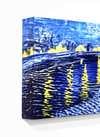
A Meditation on Color and Absence: Exploring Mark Rothko’s Untitled 162
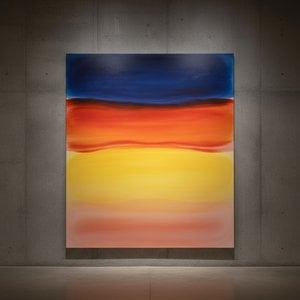
The painting “Untitled 162” by Mark Rothko stands as a testament to the power of reductive abstraction—a deceptively simple composition that belies a profound exploration of emotion and spirituality. Presented in an unassuming white canvas, this artwork eschews representational imagery altogether, opting instead for two monumental rectangles of crimson hue layered upon one another. The subtle variations in shade – a deeper orange dominating the leftmost rectangle and a paler counterpart on the right – create a mesmerizing interplay of color that captivates the viewer’s gaze.
- Style: Rothko's signature style is characterized by Color Field Painting, where large areas of pigment dominate the canvas surface. This approach prioritizes pure color over form and detail, aiming to evoke feelings rather than depict specific subjects.
- Technique: Rothko achieved his distinctive effect through a meticulous layering process. He applied thin washes of pigment onto successive canvases, building up the color gradually until it achieved an almost velvety texture. This technique ensured that the colors bled into each other subtly, creating an illusion of depth and luminosity despite the absence of discernible contours.
The painting’s historical context is inextricably linked to the broader artistic movement of Abstract Expressionism, which emerged in New York City during the postwar era. Artists like Rothko, Jackson Pollock, Willem de Kooning, and Franz Kline sought to express inner psychological states through spontaneous gestures and non-figurative forms—a reaction against the formalism of European art traditions. Rothko’s work specifically responded to the anxieties and uncertainties of the Cold War period, reflecting a preoccupation with themes of existential dread and spiritual yearning.
Symbolism: While devoid of recognizable imagery, “Untitled 162” is laden with symbolic significance. The rectangles themselves can be interpreted as representing blocks of color—fundamental elements of existence—that merge into one another, symbolizing unity and interconnectedness. The crimson hue evokes associations with passion, sacrifice, and primal emotion – mirroring Rothko’s own personal experiences of loss and trauma. Furthermore, the deliberate lack of detail encourages contemplation and invites viewers to project their own emotions onto the canvas, fostering a deeply subjective encounter.
Emotional Impact: Viewing “Untitled 162” is an experience akin to entering a meditative space. The sheer scale of the rectangles overwhelms the senses, drawing the eye inward and prompting reflection on fundamental questions about life and death. Rothko’s intention was not merely to depict color but to elicit feeling—to create a visceral response in the viewer that transcends intellectual understanding. It's a piece designed to provoke introspection and offer solace amidst the complexities of human existence.
Ultimately, “Untitled 162” remains an enduring masterpiece because it succeeds in communicating profound emotional truths through its deceptively simple visual language. Its understated elegance and evocative color palette continue to inspire artists and collectors alike, cementing Rothko’s legacy as one of the most influential figures in twentieth-century art.

 Αποστολή


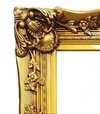


 Η επιλογή με γυαλί είναι διαθέσιμη μόνο για μεγέθη κάτω από 110 εκ.
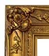