A Symphony of Abstraction: Exploring Piet Mondrian’s “Rhythm of Black Lines”
Piet Mondrian's “Rhythm of Black Lines” is more than just a painting; it’s a foundational statement of modern art, embodying the core principles of Neoplasticism – a movement that sought to distill visual language down to its most essential elements. Created during a period of radical artistic experimentation, this work represents a pivotal moment in Mondrian's own evolution and the broader trajectory of abstract art.
Deconstructing Reality: Style & Technique
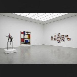
The painting is immediately recognizable for its rigorously geometric composition. Intersecting black lines define a grid-like structure across the canvas, creating a network of rectangular spaces filled with blocks of primary colors – red, blue, and yellow – alongside white and black. Mondrian’s technique emphasizes precision; the lines are crisp and clean, the color fields flat and unmodulated. This deliberate lack of texture or painterly gesture is central to Neoplasticism's rejection of subjective expression in favor of universal visual principles. The composition isn’t chaotic despite its fragmentation; instead, it achieves a remarkable sense of balance and harmony through careful proportioning and spatial relationships.
The Birth of Neoplasticism: Historical Context
“Rhythm of Black Lines” emerged from Mondrian's theoretical explorations in the years following 1917, when he co-founded *De Stijl* (The Style) with Theo van Doesburg. Disillusioned by representational art’s inability to capture underlying reality, Mondrian and Van Doesburg sought a “pure plastic art” – one based on fundamental geometric forms and primary colors. They believed this abstraction could express universal harmony and spiritual truth. This was a period of intense intellectual ferment, influenced by Theosophy and a desire for a new visual language suited to the modern age. Mondrian’s work directly challenged traditional artistic conventions, paving the way for subsequent movements like Abstract Expressionism and Minimalism.
Beyond Form: Symbolism & Meaning
While seemingly devoid of representational content, “Rhythm of Black Lines” is rich in symbolic meaning. The horizontal and vertical lines are not merely formal elements; they represent opposing forces – the static and the dynamic, masculine and feminine – brought into equilibrium. The primary colors, similarly, were chosen for their inherent energy and purity. Mondrian believed that by reducing art to these essential components, he could transcend individual subjectivity and access a universal aesthetic order. The “rhythm” in the title suggests a dynamic interplay between these elements, creating a visual cadence that resonates with the viewer.
Emotional Resonance & Lasting Influence
Despite its austere geometry, "Rhythm of Black Lines" evokes a surprisingly powerful emotional response. The clarity and balance of the composition can be calming and meditative, while the bold colors inject energy and vitality. Its enduring appeal lies in its ability to simultaneously engage the intellect and stir the emotions. The painting’s influence extends far beyond the realm of fine art, impacting architecture, design, and fashion. It continues to inspire artists and designers today, serving as a testament to Mondrian's visionary approach and the transformative power of abstract art.
Key Characteristics
- Geometric Abstraction: The artwork is entirely composed of geometric shapes – lines, rectangles, and squares.
- Primary Colors & Neutrals: The palette is limited to red, blue, yellow, black, and white.
- Orthogonal Lines: Horizontal and vertical lines dominate the composition, creating a grid-like structure.
- Balance & Harmony: Despite its abstraction, the painting achieves a remarkable sense of visual equilibrium.
Photo Description: --Overall Impression-- The artwork is a geometric abstract composition dominated by intersecting black lines and colored rectangular blocks. It’s a highly structured piece exhibiting Piet Mondrian's signature style of neoplasticism – a movement focused on reducing art to its essential forms and colors. The composition is rigidly symmetrical, creating a sense of order and balance. The dominant elements are the orthogonal lines that create a grid-like structure across the canvas. These lines are thick and black, providing strong visual contrast against the lighter colored blocks. The rectangular blocks themselves are primarily white, black, blue, red, and yellow, arranged in a systematic manner to form larger squares and rectangles. The color palette is limited and carefully chosen, aiming for harmony through complementary colors. There’s minimal use of texture; it appears to be flat painting with precise lines. Lighting seems even across the surface, suggesting a studio setting.
Size: Unknown
Date: Unknown



 Vorschau anzeigen
 Druck bestellen
 Versenden
 Teilen
 Details anzeigen

 Herunterladen
 Ähnliche Objekte
 Röntgenaufnahme
 Diashow

 Weiterlesen






































 Die Glasoption ist nur für Größen unter 110 cm verfügbar.