A Pioneer of Geometric Abstraction: Exploring Fernand Léger’s “The Typographer”
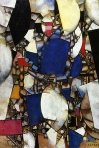
Fernand Léger's "The Typographer," painted in 1919, isn’t merely a depiction of an object; it’s a declaration of artistic intent—a bold assertion that abstraction could simultaneously honor the tangible realities of the burgeoning industrial era. This striking canvas captures a head rendered in fragmented geometric shapes – cubes, cylinders, and planes – overlaid with vibrant hues of red, yellow, and blue. The inclusion of recognizable elements like a car and a clock serves as an ingenious counterpoint to the dominant visual language, grounding the abstract forms within the familiar contours of everyday life.
- Style: Léger’s work exemplifies Cubism, specifically Analytical Cubism, pioneered by Picasso and Braque. Unlike Impressionists who sought to capture fleeting moments of light and color, Cubists dissected objects into their constituent parts, presenting multiple perspectives simultaneously on a single canvas.
- Technique: Léger employed a meticulous layering technique, applying thin washes of pigment over a textured surface created with burlap or similar materials. This method ensured that the underlying structure remained visible, contributing to the painting’s sculptural quality and emphasizing its materiality.
The historical context surrounding “The Typographer” is crucial to understanding Léger's artistic vision. Created during the height of the First World War and immediately following the Russian Revolution, France was undergoing a profound transformation driven by technological advancements and societal upheaval. Léger responded to this period with an unwavering fascination for machines – their precision, their power, and their transformative influence on human existence. The repetition of geometric forms echoes the rhythmic patterns found in factory production lines, reflecting Léger’s belief that art should engage with the realities of modern life.
Symbolism: Beyond its formal exploration of geometry and perspective, “The Typographer” carries symbolic weight. The head itself represents humanity—albeit abstracted—facing the challenges posed by industrialization. The juxtaposed objects – the car and the clock – symbolize progress and time, respectively, highlighting the artist’s preoccupation with capturing the spirit of a rapidly changing world. Léger deliberately avoids sentimental representation, opting instead for an emotionally resonant visual language that conveys both optimism and unease.
Emotional Impact: “The Typographer” transcends mere aesthetic pleasure; it compels viewers to contemplate the relationship between art and technology. The painting’s bold colors and fractured forms generate a sense of dynamism and disorientation, mirroring the anxieties and aspirations of the era. Léger's intention wasn’t simply to depict what he saw but to express how he *felt* about the world around him—a feeling characterized by both wonder and apprehension. It remains an enduring testament to the transformative power of abstraction as a vehicle for conveying complex ideas and emotions.
Fragen & Antworten
Wie alt war Fernand Léger, als „Der Typograf“ geschaffen wurde?
Fernand Léger schuf „Der Typograf“ im Alter von 38. Der Künstler wurde 1881 geboren, und das Werk datiert auf 1919.
In welchem Jahr wurde "Der Typograf" geschaffen?
"Der Typograf" von Fernand Léger entstand im Jahr 1919.
Gibt es einen Leitfaden für "Der Typograf" von Fernand Léger?
Eine Leitfaden-Seite ist für "Der Typograf" von Fernand Léger verfügbar: ein druckbares Infoblatt zum Kunstwerk, konzipiert für Schüler und den Einsatz im Unterricht.
Welche Technik wurde für "Der Typograf" verwendet und wann wurde es geschaffen?
"Der Typograf" entstand im Jahr 1919 in Öl auf Leinwand.
Wer ist der Künstler hinter "Der Typograf"?
"Der Typograf" wurde von Fernand Léger geschaffen. Die Informationen auf dieser Seite beschreiben das Originalwerk von Fernand Léger.
Wie finde ich Kunstwerke, die "Der Typograf" von Fernand Léger ähneln?
Die Seite Ähnliche Werke von "Der Typograf" von Fernand Léger zeigt verwandte Kunstwerke.
Wie stehen die Farben von "Der Typograf" zueinander?
Die Farbharmonie von „Der Typograf“ wird als Sanft nuancierte Palette beschrieben.



 In echtem Maßstab anzeigen
 Zum Druck wechseln
 Versenden als Grußkarte
 Teilen
 Details anzeigen
 Leitfaden öffnen

 Herunterladen
 Ähnliche Objekte
 Röntgenaufnahme
 Diashow
 Besucherstatistiken


 Mehr anzeigen






































 Die Glasoption ist nur für Größen unter 110 cm verfügbar.