BEZPLATNÉ UMĚLECKÉ PORADENSTVÍ
x

 Sdílet
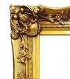
Ručně malovaná olejná barva na plátně ve vašem zvoleném rozměru i s rámem, vyrobená našimi umělci na zakázku.
Vyberte si z našich přednastavených velikostí, které odpovídají původním proporcím díla.
Můžete zadat vlastní rozměry pro konkrétní rám nebo prostor. Pokud se vámi vybraná velikost neshoduje s proporcemi původního obrazu, dílo buď ořízneme, nebo jej doplníme ručně malovanými prvky. Před zahájením výroby vám bude zaslán digitální náhled ke schválení.
Upozorňujeme, že náhled na obrazovce neodpovídá skutečnému ořezu ani rozšíření. Pouze digitální náhled přesně zobrazí finální kompozici.
Ačkoliv je možné zvolit vlastní velikost, pro zachování původních proporcí doporučujeme vybrat rozměr z předdefinovaného seznamu.
Celosvětová doprava () za 3–4 týdny namísto standardních 5 týdnů. (6 červenec). Bez kompromisů v kvalitě.


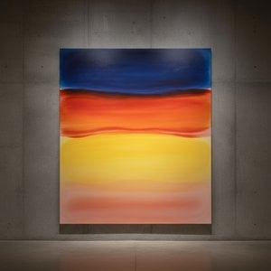
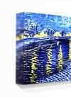
No. 3
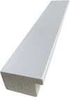
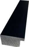
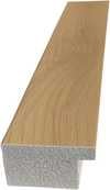
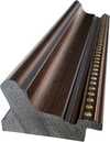
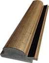
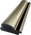
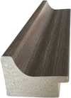
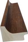
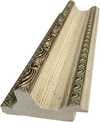
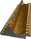
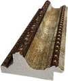
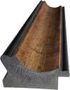
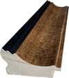
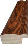
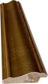
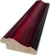
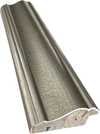
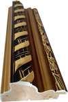
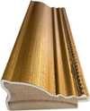
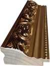
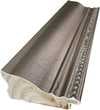
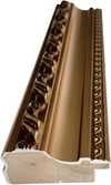
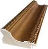
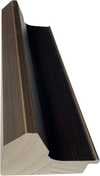
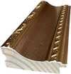
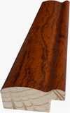
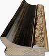
Rozměry reprodukce
Mark Rothko’s “No. 3” isn’t a painting that shouts; it whispers. It’s an invitation to quiet contemplation, a deliberate rejection of representational art in favor of pure emotional expression. Created during the heart of his mature style – roughly between 1949 and 1970 – this work embodies the core tenets of Abstract Expressionism while simultaneously forging its own unique path. The piece immediately draws the viewer into a space of profound introspection, utilizing a muted color palette dominated by deep blues, blacks, and greens layered over an orange foundation. It’s not simply a collection of colors; it's a carefully orchestrated symphony of tones designed to evoke a specific mood – one of melancholy, solitude, and perhaps even a touch of existential longing.
The power of “No. 3” lies not in its subject matter – which is deliberately ambiguous, hinting at figures or forms rather than explicitly depicting them – but in the meticulous execution of Rothko’s technique. Thick, layered brushstrokes are visible throughout the canvas, creating a tactile surface that invites close examination. These aren't sharp lines or defined edges; instead, they bleed into one another, blurring the boundaries between shapes and colors. This layering is crucial to the painting’s depth – it creates an illusion of space, drawing the eye inward and encouraging the viewer to lose themselves within the composition. Rothko famously described his paintings as “doors” or “windows,” suggesting a portal into another realm. Here, those doors are open, offering glimpses of something beyond the purely visual.
The deliberate lack of perspective is equally significant. Rothko abandoned traditional notions of linear space, opting instead for an implied sense of depth through color and layering. The overlapping forms create a dynamic interplay of positive and negative space, guiding the viewer’s eye across the canvas in a continuous, almost meditative, flow. It's a technique that mirrors the artist’s own exploration of spirituality and the search for meaning beyond the material world.
Understanding Mark Rothko requires acknowledging his deeply personal journey. Born in 1903 in Daugavpils, Latvia (then part of the Russian Empire), he experienced a childhood marked by displacement and uncertainty – a legacy of shifting borders, pogroms, and the trauma of immigration to Portland, Oregon, where his father, a pharmacist and intellectual, tragically died shortly after their arrival. This early exposure to loss and instability profoundly shaped Rothko’s artistic vision. He grappled with themes of mortality, faith, and the human condition throughout his career, seeking to express universal emotions through abstract forms. His work during this period reflects a deep engagement with existential questions – questions about life, death, and the search for meaning in an often-chaotic world.
The Rothko Chapel in Houston, Texas, serves as a poignant example of how the artist envisioned his paintings interacting with space. The fourteen Rothko panels within the chapel’s walls are designed to create a contemplative atmosphere, inviting viewers to engage in silent reflection. “No. 3” shares this spirit of quiet intensity, offering a visual meditation on the complexities of human experience.
While Rothko resisted definitive interpretations of his work, certain symbolic readings have emerged over time. The dominant blues and blacks are often associated with sadness, mourning, or introspection – reflecting the artist’s own personal struggles. The orange hue, appearing as a subtle undercurrent, can be seen as representing hope, warmth, or even spiritual illumination. The ambiguity of the forms themselves allows for individual interpretation, inviting each viewer to project their own emotions and experiences onto the canvas. “No. 3” is not simply a painting; it’s an emotional landscape – a space where the viewer becomes an active participant in the creation of meaning.


1903 - 1970 , Lotyšsko

Explore the captivating world of Color Field painting! Discover its origins, key artists like Rothko & Newman, philosophical depth, and lasting influence on modern art. Expert insights for collectors.
Explore the profound emotional depth of Mark Rothko's abstract expressionism. Discover the history, techniques & lasting impact of this pivotal Color Field painter. Expert insights for collectors and art enthusiasts.

Explore the groundbreaking abstract expressionism of Morris Louis, a pioneer of Color Field painting. Discover his innovative techniques, influential series & lasting legacy in post-war American art. Learn more at WahooArt.

Explore the life & work of Jacob Kainen, a pivotal figure in American Abstract Expressionism and Color Field painting. Discover his journey from Social Realism to vibrant abstraction and lasting influence on 20th-century art.

Explore the profound world of Color Field painting with WahooArt. Discover key artists like Rothko & Newman, its philosophical roots, and lasting impact on modern art. Expert insights for collectors.


Buďte na tahu s nejnovějšími novinkami ze světa umění, exkluzivními nabídkami a inspirativními nápady na dekoraci.
Sdělte nám více o svém projektu a naši odborníci na umění vám připraví 3 personalizované návrhy uměleckých děl.
Nechť pro vás vybereme 3 možnosti – zdarma!


 Skleněná varianta je dostupná pouze u rozměrů menších než 110 cm


