


طباعة جيكلي أو كانفاس بجودة المتاحف، مع سرعة في التنفيذ وخيارات متنوعة للتشطيب. ( شراء لوحة مرسومة يدويًا الانتقال إلى الصورة الرقمية)
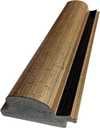
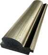
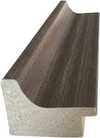
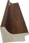
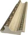
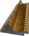
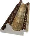
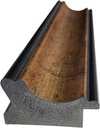
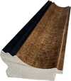
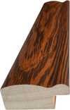
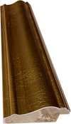
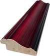
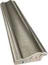
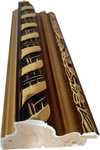
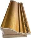
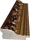
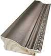
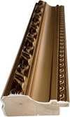
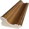
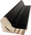
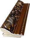
اختر من بين أحجامنا المُعدّة مسبقاً والتي تتوافق مع النسب الأصلية للعمل الفني.

أدخل العرض والارتفاع المطلوبين ليتناسب المقاس مع إطارك أو جدارك. يرجى الملاحظة أن المطبوعة يمكن قصها فقط ولا يمكن تكبيرها لتتجاوز أبعاد الصورة الأصلية، لذا فإن اختيار مقاس بأبعاد مختلفة سيؤدي إلى فقدان جزء من الصورة. سنرسل لك نموذجاً رقمياً تجريبياً لاعتماده قبل البدء في عملية الطباعة. الصورة المعروضة في هذه الصفحة لا توضح شكل القص الفعلي — النموذج التجريبي فقط هو ما يظهر ذلك بدقة.
توصيل عالمي إلى خلال أسبوعين بدلاً من المدة القياسية البالغة 4/5 أسابيع. (25 نوفمبر)
Composition
مقاس النسخة المطبوعة
The canvas known as Composition emerges from the mind of Theo van Doesburg, a work that captures a specific moment in 1923. This piece exists as a precise arrangement of form and color, born from a period of intense creative focus. The artist, Theo van Doesburg, brings a sense of equilibrium to the surface, translating abstract thought into a tangible presence. It is a work that demands attention through its structural clarity and its commitment to the principles of the De Stijl movement.
The history of this object is tied to a specific circle of thinkers and patrons. Antony Kok commissioned the work, setting it on its path through the hands of those who shaped the modern era. From there, the painting finds its way into the hands of Bart de Ligt (1883–1938), who becomes its first owner. This transition marks the beginning of a long lineage of stewardship, as the work moves from the artist's studio into a private collection where its presence remains constant.
Every line and color choice within Composition reflects the artist's pursuit of a universal visual language. As we observe the work, we see the direct result of a vision that seeks to strip away the unnecessary to find a fundamental truth. The painting remains a vital part of the history of abstraction, holding the weight of its 1923 origins in every carefully placed rectangle and primary hue.
The canvas unfolds as a precise grid of rectangles, where vertical and horizontal lines intersect to dictate the movement of the eye. There is a profound sense of equilibrium achieved through this arrangement, as non-representational forms find their place within a structured, rhythmic order. The eye moves across the surface, guided by the intersections of these straight lines, finding balance in the way the shapes occupy the space. It is a study in pure geometry, where the subject matter is stripped of any external reference, leaving only the essence of form and relation.
Color acts as the primary force within this structured environment. The palette relies on the fundamental strength of red, yellow, and blue, which anchor the composition. These primary hues interact with a supporting cast of black, white, and grey, creating a tension between the boldest tones and the more neutral shades. The colors appear solid and flat, avoiding any blending or shading, which emphasizes the stark, clean nature of the geometric arrangement. Each rectangle holds its own weight, contributing to a visual language that seeks a universal harmony through simplicity.
The history of this work begins in the creative atmosphere of Paris, where it finds its way from the artist's studio into the hands of Bart de Ligt. This acquisition likely occurs in late 1923, marking the start of a long and steady lineage. De Ligt, a man deeply connected to the avant-garde circles of the time, holds the piece within his personal collection until his passing in 1938.
From that moment, the painting enters a quiet, private chapter. It remains within the same family, passing through the hands of descendants for nearly a century. This continuity preserves the work's integrity, keeping it sheltered within a single domestic line since 1923. The colors and forms remain as they were when they first left the artist's side, held in a state of careful preservation through the decades.
The canvas captures a moment of profound transition, acting as a key work within the artist's entire oeuvre. It reveals a growing complexity within his purist style, where the rigid logic of geometry begins to dance with a more nuanced sense of equilibrium. One senses the tension between the absolute and the evolving, as the lines and colors find a new, sophisticated rhythm. This evolution suggests a mind moving beyond simple shapes toward a more intricate visual language.
A deep connection between the realm of architecture and the act of painting pulses through the work. The composition feels less like a mere arrangement of pigment and more like a blueprint for a structured reality. This link is no accident; the artist himself articulated the concept behind its creation in the magazine Architectura on 17th July 1923. The painting exists as a bridge, where the spatial logic of built environments meets the spiritual pursuit of pure abstraction.
The evolution of this geometric language unfolds through several other pieces that trace the artist's shifting focus. One can look back to Composition XX from 1920 to see the early movements of these shapes. Nearby in the timeline, the 1923 work Study for a Composition offers a glimpse into the creative process behind these structured arrangements. These works exist as part of a continuous search for balance and order within the frame.
As the years progress, the compositions grow more complex and dynamic. The 1925 Counter composition XIV introduces a different energy to the grid. Later, the Simultaneous Counter-Composition from 1929–1930 pushes the boundaries of the aesthetic even further. Each piece captures a specific moment in a lifelong pursuit of a new visual language, moving from the rigid to the more fluid and experimental.
تتناسب نسخة من "Composition" بشكل رائع مع Office.
تجمع "Composition" للفنان تيو فان دوسبورخ بين تقنية Oil On Canvas وأسلوب De Stijl؛ حيث تعبر التقنية والمدرسة الفنية عن طريقة تنفيذ العمل وطرازه الفني.
في "Composition"، يتناغم Statement التباين مع Discordant Palette الانسجام.

ثيو فان دوسبرغ، وُلد كريستيان إميل ماري كوبر عام 1883 في أوتريخت بهولندا، لم يكن مجرد رسام؛ بل كان قوة ثورية أعادت تشكيل الأسس العميقة للفن الحديث. بدأت رحلته وسط أصداء الانطباعية وما بعد الانطباعية المترددة، عاكسًا في البداية أنماطًا تذكر بفينسنت فان جوخ – سواء من حيث الموضوع أو الشدة العاطفية. ومع ذلك، كانت هذه المرحلة المبكرة بمثابة تمهيد حاسم، خطوة ضرورية نحو التحول الجذري الذي سيعرّف إرثه الدائم. جاءت لحظة محورية في عام 1913 مع لقائه بكتابات فاسيلي كاندينسكي *Rückblicke*. أثار هذا النص داخل فان دوسبرغ إدراكًا عميقًا: إن التعبير الفني الحقيقي لا يكمن في تكرار العالم الخارجي، بل في توجيه واقع روحي داخلي من خلال التجريد المطلق. من هذا الإيمان وُلد النيو بلاستيسيزم، المعروف على نطاق أوسع باسم دي ستيل – وهي حركة أسسها ودعمها بشدة، ليصبح أبرز مناصريها.
لم يكن دي ستيل مجرد نمط فني؛ بل كان بيانًا فلسفيًا شاملاً ترجم إلى شكل بصري. آمن فان دوسبرغ بتجريد الفن إلى عناصره الأساسية – الخطوط المستقيمة، والزوايا القائمة، والألوان الأولية الأحمر والأصفر والأزرق، جنبًا إلى جنب مع الأسود والأبيض والرمادي. لم يولد هذا اللوح الصاريم من القيود، بل من الرغبة في العالمية – إيمان بأن هذه الأشكال الأساسية تتردد صداها مع نظام كوني كامن. تخيل عملاً فنيًا *كليًا* يتجاوز القماش ليشمل العمارة والتصميم وحتى الأشياء اليومية. كان التعاون أمرًا أساسيًا؛ عمل فان دوسبرغ عن كثب مع المهندسين المعماريين مثل جيه.جيه.بي أود وجيريت ريتفيلد، وصمم نوافذ زجاج ملونة وأثاثًا وتصاميم داخلية كاملة تجسد مبادئ دي ستيل. امتدت تعاونه إلى زملاء الفنانين مثل بييت موندريان، الذي أسس معه مجلة *دي ستيل* المؤثرة، وهي منصة لنشر أفكارهم وجذب المبدعين ذوي التفكير المماثل. ومع ذلك، على الرغم من أصولهما المشتركة، نشأت توترات بين فان دوسبرغ وموندريان بشأن جمود النيو بلاستيسيزم. قدم فان دوسبرغ “العنصرية الأولية” في عام 1926، ودافع عن الخطوط المائلة والتكوينات الأكثر ديناميكية – وهو انحراف أدى في النهاية إلى انشقاق داخل الحركة، وكشف عن روحه المضطربة وسعيه المستمر للابتكار الفني.
بينما يحتفى به كرسام، كانت مساعي فان دوسبرغ الفنية متنوعة بشكل ملحوظ. كان كاتبًا وشاعرًا وناقدًا غزير الإنتاج، واستخدم قلمه لصياغة الأسس النظرية لدي ستيل وتحدي المفاهيم التقليدية للفن. أدى انخراطه في حركة دادا في أوائل العشرينيات من القرن الماضي إلى توسيع آفاقه الفنية، مما أدى إلى أعمال تجريبية تضمنت الكولاج والطباعة. شهدت هذه الفترة أيضًا تدريسه في باوهاوس، حيث شارك أفكاره مع جيل جديد من الفنانين والمصممين. لم يكتف بالبقاء ضمن حدود أشكال الفن التقليدية؛ سعى فان دوسبرغ بنشاط لدمج الفن في الحياة اليومية، مؤمنًا بقدرته على تغيير المجتمع. لم تكن تصميماته للداخل والأثاث مجرد تمارين جمالية بل محاولات لخلق مساحات معيشة متناغمة تعكس مبادئ دي ستيل. مثال رئيسي هو تعاونه مع صوفي تاوبر-آرب وجورج فانتونجيلو في تصميم منازل الفنانين، مما يدل على نهج شمولي للإبداع الفني – وهي محاولة لبناء عالم *على غرار* مثاله.
قُصِرت حياة ثيو فان دوسبرغ بشكل مأساوي في عام 1931 عن عمر يناهز 47 عامًا، إلا أن تأثيره على الفن الحديث لا يزال عميقًا. مارست دي ستيل، على الرغم من قصرها نسبيًا كحركة متماسكة، تأثيرًا هائلاً على التطورات الفنية اللاحقة، بما في ذلك تصميم باوهاوس والبساطة والتركيبية. يستمر تركيزه على التجريد الهندسي والألوان النقية والوظيفية في إلهام الفنانين والمصممين اليوم. تذكر أعماله أن الفن لا يتعلق فقط بالتمثيل ولكن باستكشاف الأشكال والأفكار الأساسية. يمتد إرث فان دوسبرغ إلى ما هو أبعد من لوحاته وتصميماته؛ إنه يكمن في التزامه الثابت بالابتكار الفني وإيمانه بالقوة التحويلية للتجريد. تستمر رؤيته لعالم موحد ومتناغم – معبرًا عنها بلغة دي ستيل – في إلهام أولئك الذين يسعون إلى خلق بيئة أكثر جمالاً ومعنى.
يمكن رؤية تأثير فان دوسبرغ في عدد لا يحصى من جوانب التصميم الحديث – من الهندسة المعمارية والأثاث إلى التصميم الجرافيكي والطباعة. يظل شخصية محورية في تاريخ الفن، ورائدًا حقيقيًا تجرأ على تحدي الاتفاقيات وتصور لغة بصرية جديدة للقرن العشرين وما بعده – إرث محفور بالخطوط المستقيمة والألوان الأولية.

1883 - 1931 , هولندا

Explore 25 iconic Wassily Kandinsky masterpieces and the birth of abstraction. Discover the full collection online at WahooArt.com.

Explore the revolutionary De Stijl movement & Neo-Plasticism with our expert guide. Discover Piet Mondrian, Theo van Doesburg, and the lasting impact of this influential art style. Learn about collecting & investing in De Stijl masterpieces.

اكتشف 10 روائع فنية غيرت مسار التجريد الهندسي! تعرف على بيكاسو، موندريان وماليفيتش وغيرهم. لوحات أصلية وإعادة إنتاج فاخرة لديكور عصري. استلهم منزلك مع WahooArt.com
Explore the profound influence of geometry and line in fine art. Discover how structural composition creates visual impact, from Cubist mastery to Op Art precision, and learn to curate sophisticated, mathematically balanced collections for discerning art connoisseurs.

Embark on a journey through the Rijksmuseum's greatest treasures. From Rembrandt’s dramatic shadows to Vermeer’s luminous light, explore 25 iconic Dutch masterpieces and find museum-quality art reproductions for your decor. Discover all masterpieces on WahooArt.com.
 معاينة الحجم الواقعي

 مشاركة
 مشاركة
 التفاصيل
 دليل


 تحميل الملف
 قطع مشابهة
 الأشعة السينية
 عرض شرائح
 الأسئلة والأجوبة

 الإحصائيات


 عرض المزيد


 خيار الزجاج متاح فقط للمقاسات التي تقل عن 110 سم


