x

 مشاركة
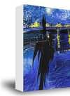
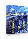
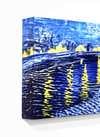
 1932
1932 5.0 x 28.0 cm
 Lentos Kunstmuseum Linz
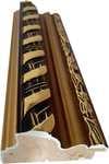
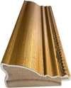
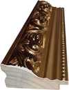
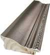
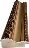
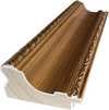
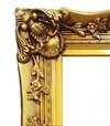
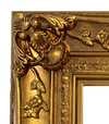
لوحة زيتية مرسومة يدوياً على الكانفاس بالمقاس والإطار الذي تفضله، تُنفذ حسب الطلب على أيدي فنانينا.
اختر من بين أحجامنا المُعدّة مسبقًا والتي تتطابق مع النسب الأصلية للعمل الفني.
يمكنك إدخال أبعادك الخاصة لتناسب إطارًا معينًا أو مساحة محددة. وإذا لم يتطابق الحجم الذي اخترته مع نسب الصورة الأصلية، فسنقوم إما بقص العمل الفني أو توسيع اللوحة بإضافة عناصر مرسومة يدويًا. سيتم إرسال نموذج رقمي إليك للموافقة عليه قبل بدء الإنتاج.
يرجى ملاحظة أن المعاينة على الشاشة لا تعكس عملية القص أو التوسيع الفعلية؛ حيث إن النموذج الرقمي وحده هو الذي سيوضح التكوين النهائي بدقة.
وعلى الرغم من توفر أحجام مخصصة، إلا أننا نوصي باختيار أبعاد من القائمة المحددة مسبقًا للحفاظ على النسب الأصلية للعمل الفني.
توصيل عالمي إلى خلال 3 إلى 4 أسابيع بدلاً من المدة المعتادة البالغة 5 أسابيع. (17 يوليو). جودة لا تهاون فيها.


Selfportrait
مقاس النسخة المطبوعة
Herbert Bayer (1900-1985) stands as a singular figure in 20th-century art and design, a pivotal bridge between the radical experimentation of the Bauhaus and the burgeoning modernism that shaped American culture. Born in The Hague, Croatia (though he later identified primarily with Austria), Bayer’s life was a testament to artistic reinvention, marked by a relentless pursuit of simplification and a profound impact on typography, architecture, and corporate identity. His journey from apprentice under Georg Schmidthammer to director of printing at the Bauhaus, then art director for *Vogue*, and finally as a key figure in shaping the visual language of Atlantic Richfield Company (ARCO), reveals an artist constantly adapting and pushing the boundaries of his craft.
Bayer’s early training at the Weimar Bauhaus was foundational. Immersed in the school's philosophy of “form follows function,” he quickly absorbed the principles of reductive design championed by Walter Gropius. However, it wasn’t merely adherence to established doctrine that defined his approach; Bayer possessed a uniquely intuitive sense for visual communication. He experimented with typography, rejecting traditional hierarchies and embracing a bold, all-lowercase sans-serif style – a deliberate departure from the conventions of the time. This “universal alphabet,” conceived in 1925 but never fully realized as a commercial typeface, remains a cornerstone of his legacy, influencing subsequent type designers like ITC Bauhaus and Architype Bayer.
Bayer’s work at the Bauhaus was characterized by an unwavering commitment to clarity and efficiency. He meticulously redesigned publications for the school, utilizing a crisp, geometric sans-serif typeface that prioritized legibility and reduced visual clutter. This approach extended beyond typography; he explored graphic design principles, advocating for a minimalist aesthetic rooted in geometric abstraction. His designs were not merely decorative but served as tools for effective communication – a philosophy deeply ingrained within the Bauhaus ethos.
Leaving Germany in 1937 due to the rise of Nazism, Bayer found new opportunities in Berlin and later America. He joined *Vogue* magazine’s Berlin office, continuing his exploration of modern design principles. His time in the United States marked a shift towards corporate art direction, culminating in his influential role at ARCO. This period saw him transform the company's visual identity, establishing a sophisticated and instantly recognizable brand through a combination of striking typography, architectural designs, and memorable logos.
Bayer’s tenure as art director for Atlantic Richfield Company (ARCO) represents perhaps his most significant and enduring achievement. Recognizing the power of visual communication to shape corporate culture, he assembled one of the world's largest and most influential corporate art collections. He wasn’t simply purchasing artwork; he was curating an environment that reflected the company’s values – innovation, dynamism, and a forward-looking perspective.
His influence extended beyond mere selection; Bayer designed the ARCO Plaza headquarters in Los Angeles, incorporating his signature minimalist aesthetic into the building's architecture. He also created iconic visual elements for the company, including its logo and promotional materials. The “Double Ascension” fountain between the twin towers of ARCO Plaza stands as a testament to his creative vision and enduring legacy within the corporate world.
Herbert Bayer’s impact on 20th-century design is undeniable. His pioneering work in typography, particularly his development of the all-lowercase sans-serif typeface, continues to influence designers today. His reductive aesthetic—characterized by simplicity, clarity, and geometric abstraction—laid the groundwork for movements like Minimalism and Swiss Style.
Beyond specific techniques, Bayer’s approach to design – a focus on functionality, communication, and visual impact – remains remarkably relevant in our increasingly complex world. He demonstrated that good design isn't about ornamentation; it's about creating meaningful connections between ideas and audiences. His legacy endures not only through his iconic designs but also as an inspiration for generations of artists and designers seeking to shape a more visually compelling future.

1900 - 1985 , Croatia


ابقَ على اطلاع بأحدث أخبار الفن، والعروض الحصرية، وأفكار الديكور.
أخبرنا عن مشروعك، وسيقدم لك خبراؤنا الفنيون 3 اقتراحات فنية مخصصة لك.
دعنا نختار لك ٣ خيارات مخصصة تماماً - مجاناً!
 خيار الزجاج متاح فقط للمقاسات التي تقل عن 110 سم


