
由我们的艺术家按需定制,为您提供您所选尺寸及画框的布面手工油画。 ( 切换至版画销售渠道 切换至数字图像销售渠道)





























您可以从与原作比例一致的预设尺寸中进行选择。

请输入您需要的宽度和高度,以适配您的画框或墙面。由于作品为手工绘制,若您选择不同的尺寸比例,艺术家可能会在画面边缘多画一些或稍作裁剪 —— 由您决定。在开始绘画之前,我们会为您发送一份数字效果图供您确认。本页面上展示的图片并非最终实物 —— 只有效果图才能反映真实结果。
第16号
复刻品尺寸说明


1903 - 1970 , 拉脱维亚

Explore the profound history and emotional depth of Color Field painting. From Mark Rothko to Barnett Newman, discover how pure color redefined modern art through our expert-led guide for students and collectors alike.

Explore the profound emotional depth of Color Field painting. Our expert guide delves into the post-war origins of Abstract Expressionism, analyzing masterpieces by Rothko and Newman. Discover museum-grade, hand-painted oil reproductions that bring art history to your walls.

Explore the profound emotional depth of Color Field painting. Discover the history of mid-century abstraction, from Rothko to Newman, and learn how pure color transforms the viewer's experience through our expert art history guide.

探索抽象表现主义的十幅经典杰作!波洛克、罗斯科等大师作品,揭秘艺术史上的重要瞬间。WahooArt.com为您呈现高品质艺术品复制和精选家居装饰方案,感受现代艺术的力量与魅力。立即浏览全系列!
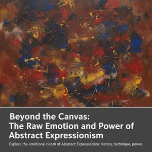
Explore the profound emotional depth of Abstract Expressionism. From the visceral energy of Action Painting to the serene beauty of Color Field, discover the history and mastery behind this transformative movement for the discerning art collector.


 实景预览
实景预览
 发送
发送 分享
分享
 详情
详情 指南
指南

 下载图片
下载图片
 相似作品
相似作品 X射线
X射线 幻灯片播放
幻灯片播放 统计数据
统计数据


 阅读全文
阅读全文









 玻璃选项仅适用于110厘米以下的尺寸。


