Kerry Harker: A Symphony of Color and Vintage Echoes
Kerry Harker’s work is immediately arresting – a vibrant collision of saturated hues, reminiscent of mid-century American advertising posters and vintage ceramics. Yet, beneath the surface exuberance lies a considered exploration of form, color theory, and the enduring power of historical imagery. Born in 1971, Harker has steadily cultivated a distinctive artistic voice rooted in both meticulous craft and a deep appreciation for the aesthetic traditions of the past.
Harker’s journey began with formal training at Cleveland College of Art & Design and continued at The University of Leeds, culminating in a BA (Hons) in Fine Art and an MA in Feminist History. This dual grounding – artistic practice alongside critical inquiry into gender and visual culture – profoundly shaped her approach to ceramics. Her early experiences at institutions like the Bridget Riley Art Foundation further solidified her understanding of color theory and its potential for expressive communication. Crucially, Harker’s work isn't simply a nostalgic homage; it’s an active engagement with history, reinterpreting familiar motifs through a contemporary lens.
The Language of Form and Color
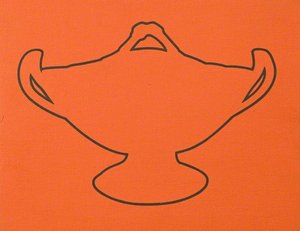
At the heart of Harker’s practice lies a masterful manipulation of form and color. She primarily works with porcelain, meticulously hand-building teacups, jugs, tureens, and other tableware pieces – objects imbued with both functional utility and decorative significance. Her palette is boldly chromatic, drawing heavily from the saturated hues prevalent in vintage advertising campaigns of the 1950s and 60s. These bold, unapologetic colors—think vibrant oranges, yellows, pinks, and blues—evoke a sense of nostalgia while simultaneously possessing a strikingly modern energy.
Harker’s process is intensely detailed. She begins with hand-thrown forms, often incorporating elements of asymmetry and irregular shaping to subtly disrupt the formality of traditional ceramics. The surfaces are then glazed using multiple layers, building up complex textures and shimmering effects that amplify the intensity of the colors. This layering technique isn't merely decorative; it’s a deliberate exploration of transparency and depth, creating an illusionistic quality reminiscent of vintage posters and illustrations.
Influences and Historical Context
Harker’s work is deeply informed by several key influences. The visual language of American advertising—particularly the bold typography, graphic patterns, and vibrant color schemes—serves as a primary source of inspiration. She also draws heavily from the history of ceramics, referencing both traditional English porcelain production and the rise of mass-produced tableware in the 20th century. Her participation in the Jonathan Vickers Fine Art Award residency provided an opportunity to explore the rich heritage of Derbyshire pottery, culminating in pieces like “Orange Sauce Tureen,” which directly referenced the region’s industrial past.
Furthermore, Harker's academic background in feminist history informs her engagement with historical imagery. She often uses these motifs—floral patterns, geometric shapes, and stylized figures—to explore themes of gender, identity, and cultural representation. Her work subtly challenges conventional notions of beauty and femininity, offering a fresh perspective on familiar symbols.
Recognition and Legacy
Kerry Harker’s distinctive style has garnered significant recognition within the contemporary ceramics world. She has exhibited extensively in galleries across the UK, including London, Leeds, and Manchester, and her work is featured in prestigious collections such as The Kerry Stokes Collection in Perth, Australia. Her residency at the Jonathan Vickers Fine Art Award further cemented her position as a leading figure in British ceramic art.
More recently, Harker has been involved in curatorial projects, including a community-based initiative exploring the politics of contemporary art and urban green space in east Leeds. This demonstrates a commitment to engaging with broader social issues through her artistic practice. Kerry Harker’s work is not simply beautiful; it's thoughtful, evocative, and deeply rooted in both historical context and contemporary concerns – a testament to her skill as an artist and her unique vision.