Introduction Forget the neon overload for a second. While we usually hunt for that high-impact, saturated punch that defines modern street art and pop culture, there is a profound, quiet power found in the understated. We are diving into the world of...
There is a specific type of visual noise that defines our current era—a high-contrast, saturated overload that demands attention through sheer volume. Yet, for the seasoned collector, the most profound statements often arrive in a whisper. The use of "putty" tones—those desaturated, earthy neutrals like warm beige, weathered stone, and delicate taupe—functions as a necessary lull in this visual storm. These colors do not compete for dominance; instead, they provide the essential shadows and mid-tones that give a canvas its weight and soul.
To study these palettes is to understand that color is often most effective when it retreats. By embracing a more restrained spectrum, artists create a space where the eye can settle without fatigue. These muted foundations act as a stage, allowing for the subtle drama of light to perform its most intricate feats. When we move away from the loud and toward the understated, we find a sense of permanence that digital screens and hyper-saturated graphics simply cannot replicate.
Structural Integrity: How Desaturation Anchors Form
A Contemplative Interior: Unveiling Braque’s ‘Interior with Palette’ Georges Braque's *Interior with Palette*, painted in 1942, offers a compelling glimpse into the artist’s mature style – a refined and introspective phase following his pivotal role ...
In the realm of complex composition, color can often act as a distraction, pulling the eye away from the underlying geometry. This is precisely why some of the most significant works in history rely on a monochromatic or near-neutral arrangement to maintain their architectural stability. Consider the visceral impact of Pablo Picasso’s Guernica. While the subject matter is fragmented and chaotic, the work is held together by a rigorous, almost structural balance of sharp angles and interlocking planes. By stripping away the distraction of color and utilizing a stark palette of greates, blacks, and muted whites, Picasso forces the viewer to confront the raw, journalistic impact of the forms themselves.
This principle extends into the evolution of Cubism, where the focus shifts from representation to the very mechanics of sight. In Georges Braque’s Interior with Palette, the use of greens and browns contributes to a somber, contemplative mood, emphasizing structure over naturalistic detail. The muted palette allows the geometric simplification of everyday objects—chairs, tables, and plants—to take center stage. Without this restraint, the fractured planes might dissolve into visual clutter; instead, they achieve a sense of solidity and rhythmic stability.
Atmospheric Nuance: Light and Shadow in the Danish Tradition
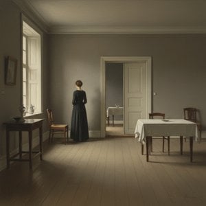
The Enigmatic Stillness of Vilhelm Hammershøi To stand before a painting by Vilhelm Hammershøi is to step across a threshold into a realm suspended between memory and dream. His work possesses an almost palpable silence, a quietude that seems to abso...
Beyond mere structure, muted tones possess a unique ability to render the intangible. In the late 19th and early 20th centuries, particularly within the Danish tradition, artists mastered the art of using desaturated hues to capture the very essence of atmosphere. The Hirschsprung Collection in Copenhagen serves as a vital repository for this exploration of light. Here, the works of the Golden Age utilize an ethereal, diffused light that feels almost spiritual, grounding the viewer in the quiet dignity of the era.
Vilhelm Hammershøi stands as perhaps the most profound practitioner of this atmospheric stillness. His canvases are meditations on absence and the delicate passage of time. Utilizing a signature palette of soft grays, pale creams, and whispers of dusty ochre, Hammershøi transforms domestic interiors into stages for psychological drama. In his hands, light is not merely illumination; it is a tangible element that seems to emanate from within the paint itself. The muted tones allow him to manage negative space so effectively that the emptiness becomes the most eloquent subject, inviting a state of profound introspection.
Modern Minimalism: The Tactile Presence of Earth Tones
A Vision of Neo-Abstract Serenity Monolithic Serenity: An Eternal Dance of Celestial Curves and Muted Earth Tones is a profound exploration of balance, weight, and stillness. This masterpiece from the WahooArt.com Studio collection reimagines the pri...
In contemporary abstraction, the use of neutral palettes has evolved into a study of weight, texture, and modern minimalism. This is evident in the Neo-Abstract works of Laurent Fabre, such as Monolithic Serenity: An Eternal Dance of Celestial Curves and Muted Earth Tones. Here, the palette of matte black, soft taupe, and desaturated sage grey creates a monumental presence that feels both ancient and avant-garde. The composition orchestrates a silent dialogue between massive, sweeping crescents and fluid forms, where the lack of vibrant color allows the viewer to focus on the balance and stillness of the work.
This tactile approach is mirrored in the textures of the Plaster & Texture art movement. Works like David Moreau’s Fragmented Serenity in Slate and Cream utilize heavy impasto patches of creamy white, pale sand, and deep slate blue to create a three-dimensional landscape. In these pieces, the "color" is often secondary to the physical ridges and valleys of the paint. The muted palette is essential here; it prevents the heavy texture from becoming overwhelming, ensuring that the interplay of light and shadow across the sculptural surface remains the primary focus.
The Enduring Anchor: Finding Stillness in a Saturated Era
Kenneth Callahan: Weaver of the Northwest Mystique Kenneth Callahan (1905-1986) wasn’t merely a painter; he was a conjurer, a weaver of landscapes and emotions that captured the very soul of the Pacific Northwest. Born in Seattle, Washington, into a ...
As we navigate an increasingly hyper-digital landscape, the pull toward the understated grows stronger. The muted, earthy tones found in these historical and contemporary works offer a much-needed visual sanctuary. They provide a sense of professional elegance and a calm that integrates seamlessly with modern architecture, from minimalist corporate spaces to high-end residential interiors.
Whether it is the mystical realism of Johannes Torrentius or the Northwest School landscapes of Kenneth Callahan—which utilized muted palettes to capture the misty, rugged beauty of the Pacific Northwest—the lesson remains consistent: strength does not require a shout. The most enduring legacies are often found in the quietest whispers of color, proving that true impact resides in the mastery of restraint. At WahooArt.com, we continue to celebrate this tradition, offering collectors the opportunity to acquire pieces that embody this profound, silent power.
Discover the captivating world of Vilhelm Hammershøi with WahooArt. Explore his serene interiors, masterful use of light & symbolism. Expert insights for discerning collectors and art enthusiasts.
Descubra os 10 mestres do Barroco Holandês! Explore a história e o legado de Rembrandt, Vermeer e outros artistas icônicos. Encontre reproduções de arte de alta qualidade para decorar sua casa com elegância em WahooArt.com.
Explore the timeless beauty of muted putty tones through 10 iconic masterpieces. From classical techniques to modern minimalism, discover the stories behind these neutral-toned legends and find museum-quality reproductions for your decor. Explore the full collection on WahooArt.com.



 10 Iconic Masterpieces Defined by Muted Putty Tones
 Interior with Palette
 Vilhelm (Hammershøi)Hammershoi
 Monolithic Serenity: An Eternal Dance of Celestial Curves and Muted Earth Tones
 Kenneth Green