The Visionary Palette: Georg Dehio and the Science of Seeing Georg Dehio (1850-1932), a name perhaps less immediately recognizable than some of his contemporaries, occupies a pivotal position in the history of art – not as a painter of grand narrativ...
To understand why a canvas vibrates with life, one must first look to the physics of light itself. Long before the Impressionists sought to capture the fleeting shimmer of a pond, the groundwork for seeing color was laid by the rigorous observations of Isaac Newton. In his 1672 paper, Newton dismantled the notion that white light was a singular, pure entity, revealing instead a complex spectrum of constituent colors. This scientific revelation shifted our understanding from color as an intrinsic property of objects to color as a phenomenon of light interaction—a realization that would later allow painters to treat the canvas as a laboratory for optical truth.
This transition from the purely physical to the painterly finds its most profound expression in the works of Claude Monet. In pieces such as The Water Lily Pond, Pink Harmony, we see the scientific spectrum translated into an emotional experience. The light is not merely illuminating the water; it is actively constructing the scene through a delicate balance of soft pinks, lush greens, and luminous whites. By understanding that light is composed of various wavelengths, artists learned to manipulate these frequencies to recreate the sensation of atmosphere rather than the rigidity of form.
The legacy of this discovery remains central to how we perceive depth and luminosity today. When we observe the way light dissolves the edges of a lily pad or reflects off an arched bridge, we are witnessing the practical application of Newton’s spectrum. The science of sight provides the vocabulary, but it is the artist who uses that vocabulary to compose a visual poem.
Simultaneous Contrast: Chevreul’s Law and the Impressionist Brushstroke
Frank Vincent Dumond: Bridging Barbizon and Impressionism Frank Vincent Dumond (1865-1951) stands as a fascinating confluence of artistic movements—a steadfast devotee of the Barbizon school’s earthy realism tempered by the burgeoning brilliance of I...
The perception of color is never static; it is a reactive process where one hue constantly influences its neighbor. In 1839, Michel Eugène Chevreul articulated this through his Law of Simultaneous Color Contrast, observing that the presence of one color alters the appearance of another. This discovery provided a technical blueprint for artists to create visual energy without relying on heavy black outlines or muddy shadows. By placing contrasting hues in close proximity, they could induce a sense of vibration and movement directly within the viewer's eye.
This principle was the engine behind the revolutionary techniques of the Impressionist movement. Rather than blending pigments on a palette until they reached a flat uniformity, artists began using broken brushstrokes—small, unblended dabs of color placed side-by-side. This method relies on the eye to perform "partitive mixing," where the brain perceives a new, more luminous shade from the interaction of individual dots. It is a technique that demands an active viewer, one who engages with the canvas to resolve the flickering light into a coherent image.
We see this tension masterfully executed in the works of Frank Vincent Dumont. His "Prismatic Palette" was not merely a stylistic choice but a pedagogical tool designed to teach students how to harness these very laws of contrast. By utilizing complementary hues to generate dynamic compositions, Dumont bridged the gap between the earthy realism of the Barbizon school and the burgeoning brilliance of Impressionism. He understood that true vitality in painting comes from the calculated friction between colors.
Chromatic Tension: The Strategic Logic of Complementary Pairs
A Study in Quiet Elegance: Whistler’s Exploration of Color Harmony James Abbott McNeill Whistler's “Harmony in Flesh Colour and Red,” completed in 1869, stands as a cornerstone of Aestheticism—a movement dedicated to elevating art beyond mere narrati...
At the heart of a compelling palette lies the strategic use of opposition. Complementary colors—those situated directly across from one another on the color wheel, such as blue and orange or red and green—possess a unique ability to cancel each other out into a neutral gray when mixed, yet create maximum drama when placed side-by-side. This tension is a deliberate tool used to direct the eye and establish focal points within a composition. A single spark of warm orange can command an entire landscape if it is set against a sea of deep, cool blues.
This logic extends into the more modern applications of color science, where models like RGB and CMYK utilize complementary pairs to achieve balance in digital and print media. However, in the realm of fine art, this tension is used to simulate the natural behavior of light and shadow. For instance, an observant painter knows that the shadow cast by a vibrant red object will often contain hints of its complement, such as blue-green, lending a sense of profound realism and atmospheric depth to the work.
James Abbott McNeill Whistler utilized this concept of tonal balance with extraordinary restraint in Harmony in Flesh Colour and Red. Eschewing the dramatic narratives of his era, Whistler focused on the sophisticated interplay of muted reds and yellows. His work demonstrates that tension does not always require loud, clashing pigments; rather, it can be achieved through a highly calibrated arrangement of tones that prioritize harmony and aesthetic poise above all else.
Analogous Fluidity: Mimicking Natural Transitions through Color
A Life Immersed in Light and Family: The World of Rae Sloan Bredin Rae Sloan Bredin, born in Butler County, Pennsylvania, in 1880, was an artist whose life and work were deeply intertwined with the burgeoning American Impressionist movement. His stor...
While contrast provides drama, analogous color schemes provide the soul of tranquility. By selecting hues that sit adjacent to one another on the color wheel—such as the transition from deep blue to teal to soft green—an artist can create a sense of seamless, organic flow. This technique mimics the natural gradients found in the world around us, from the shifting colors of a sunset to the layered foliage of a forest, evoking a feeling of ease and continuity that is inherently pleasing to the eye.
This fluidity is a hallmark of the landscapes found within the Hill-Stead Museum, where the art exists in a lived-in harmony with its surroundings. In such settings, analogous palettes allow the paintings to breathe alongside the architecture and the landscape. The soft transitions between colors create an atmosphere of peace, inviting the collector to linger in the quietude of the scene rather than being startled by sudden visual shifts.
The mastery of these subtle transitions is evident in the works of Rae Sloan Bredin. His approach favored a more deliberate, layered application of paint, creating luminous effects and soft transitions that captured the gentle dignity of American life. By leaning into the natural ease of analogous harmonies, Bredine achieved a sense of permanence and grace, proving that the most profound emotional resonances often come from the quietest color relationships.
The Subjective Eye: From Physiological Theory to Artistic Application
A Sanctuary of Vision: The Soul of The Barnes Foundation To step into The Barnes Foundation is to enter a space where the boundaries between art, life, and education dissolve into a singular, transformative experience. Located in the heart of Philade...
The evolution of color theory is a journey from the objective to the subjective. While early thinkers like Aristotle and Ptolemy offered foundational musings on how light interacts with matter, later theorists like Thomas Young hypothesized the physiological basis of trichromacy—the idea that our eyes perceive the world through three primary channels. This realization moved the conversation from the physics of the light source to the biology of the observer, suggesting that color is as much a product of human perception as it is of physical reality.
This intersection of science and sensation is perhaps most elegantly curated within The Barnes Foundation. The collection is designed as a "living laboratory for the eyes," where the arrangement of works by Renoir, Cézanne, and Matisse encourages a rhythmic dialogue between the viewer and the canvas. Here, the act of looking becomes an intellectual exercise in perceiving the hidden threads of color and form that connect disparate eras of modern vision.
Ultimately, the power of a painting lies in its ability to trigger these physiological and emotional responses. Whether through the intense afterimages produced by staring at a vibrant hue or the calming effect of a monochromatic blue, the artist manipulates our biological hardware to achieve an aesthetic end. The science provides the mechanism, but the art provides the meaning, transforming a mere optical event into a lasting memory.
The Orchestrated Collection: Achieving Visual Balance in Modern Spaces
A Glimpse into a Golden Age: Discovering Hill-Stead Museum Nestled amidst the rolling hills of Farmington, Connecticut, Hill-Stead Museum isn’t merely a repository for art; it's an immersive experience, a carefully preserved world that breathes with ...
For the modern collector, selecting artwork is an exercise in architectural orchestration. A single painting does not exist in isolation; it interacts with the light of the room, the textures of the furniture, and the existing color palette of the interior. The challenge lies in finding a piece that complements the space without being swallowed by it—a balance achieved through a sophisticated understanding of color weight and tonal value.
When integrating works into a contemporary setting, one might consider the "multi-panel" trend, where a single image is split across several canvases to create a sense of expansive movement across a large wall. This approach requires meticulous attention to how colors and brushstrokes flow from one panel to the next, ensuring that the visual narrative remains cohesive. Similarly, the use of custom framing—whether in gold leaf or natural wood—serves as the final structural element that anchors the artwork to its environment.
At WahooArt.com, we view every commission and reproduction as a vital component of this larger design narrative. Whether you are seeking a large-format mural for a hotel lobby or a bespoke portrait that mirrors your family's unique palette, our process is designed to ensure absolute harmony. Through our Professional Digital Mockup Service, we allow you to see the composition within your specific space before the first stroke of oil touches the canvas, ensuring that every selection is a deliberate and masterful addition to your collection.
Explore the fascinating evolution of color theory in art history! Discover Impressionism, Neo-Impressionism & beyond with expert insights for collectors and enthusiasts. Learn about Seurat's techniques & the psychology of color.
Explore the revolutionary art of Georges Seurat and the science behind Pointillism. Discover chromoluminarism, optical mixing, and the lasting impact of Neo-Impressionism on modern art history.
Descubre las 25 obras maestras de James Abbott McNeill Whistler, el maestro del impresionismo y la armonía en arte. Explora retratos icónicos, nocturnos evocadores y su innovadora paleta de colores. Reproducciones de arte exclusivas en WahooArt.com.
¡Hola! Puedo ayudarte a elegir una obra de arte, realizar el seguimiento de un pedido o resolver tus dudas sobre la garantía. ¿En qué puedo ayudarte hoy?



 Georg Dehio Gustav Von Bezold
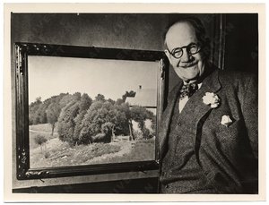 Frank Vincent Dumond
 Harmony in Flesh Colour and Red
 Rae Sloan Bredin
 The Barnes Foundation
 Hill-Stead Museum


