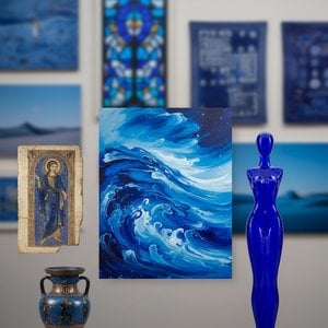
Ultramarine is a deep blue pigment historically derived from lazurite, the principal component of the metamorphic rock lapis lazuli. The pigment was produced by grinding the stone and undergoing a complex washing process to isolate the blue mineral, ...
To understand the history of blue is to understand a legacy of scarcity and devotion. For centuries, the most profound azure was not merely a color but a geological treasure, extracted from the semi-precious stone lapis lazuli. Mined primarily in the remote Sar-e-Sang mountains of northeastern Afghanistan, this mineral traveled through arduous trade routes to reach the workshops of Europe. The process of transforming raw stone into pigment was an exercise in patience; artists had to grind the rock and undergo a complex washing ritual involving melted wax, resins, and lye to isolate the pure lazurite particles. This labor-intensive method produced a blue so precious it was often valued as highly as gold.
In the Renaissance, this scarcity dictated the very hierarchy of composition. The pigment, known as ultramarine, was reserved for the most sacred subjects, most notably the robes of the Virgin Mary, where its presence signaled both spiritual purity and immense social status. One finds traces of this reverence in the works of Pietro Perugino, who applied ultramarine to the upper layers of drapery over an underpainting of more common azurite. Johannes Vermeer similarly utilized the pigment with extreme restraint, applying it only to specific surfaces where he intended to command the viewer's attention. This tradition of using blue as a marker of importance remains a fundamental principle in how we perceive value within a canvas.
Lapis Lazuli: The geological origin of the world's most prestigious blue.
Ultramarine: A pigment literally meaning "beyond the sea," signifying its long journey from Afghanistan to Europe.
Symbolism: The historical association of deep blue with divinity, holiness, and permanence.
Introduction To step into a gallery dominated by the deep, nocturnal depths of Prussian Blue is to enter a world where light and shadow engage in their most profound dialogue. There is a specific, haunting gravity to this pigment—a color that does no...
The eighteenth century brought a chemical revolution that fundamentally altered the painter's ability to render the night. The accidental discovery of Prussian blue in Berlin around 1704 provided a stable, intense alternative to the prohibitally expensive natural ultramarine. This synthetic breakthrough liberated the palette, allowing for a new exploration of depth and atmospheric tension. Unlike its mineral predecessors, Prussian blue possessed a haunting gravity, capable of capturing the nuanced transitions of twilight and the heavy, velvet recesses of a nocturnal landscape.
This pigment became the silent narrator in the works of masters like Thomas Gainsborough and Canaletto, who utilized its deep tones to render the shifting Venetian skies. It offered a way to paint shadows that felt alive with movement rather than merely being an absence of light. In the hands of later artists, such as Hokusai, this deep blue became essential for capturing the churning power of ocean waves. The transition from the geological rarity of lapis lazary to the industrial precision of Prussian blue represents a shift from the precious to the expressive, allowing for a more democratic yet equally profound use of shadow in Western art.
Cobalt blue is a blue pigment consisting principally of cobalt(II) aluminate, CoAl2O4, made by sintering cobalt(II) oxide with aluminium(III) oxide (alumina) at high temperatures. It is used as a ceramic color, in automotive and industrial coatings, ...
If Prussian blue provides the depth of the night, cobalt blue offers the clarity of the day. Developed as a synthetic rival to ultramarine in the early nineteenth century, cobalt blue introduced a different kind of luminosity to the canvas. It is characterized by its stability and a brightness that does not rely on the heavy, opaque weight of mineral pigments. This allowed for a more fluid, atmospheric approach to light, particularly in the rendering of skies and distant horizons.
The influence of this pigment is visible in the works of J.M.W. Turner, where it helps create the hazy, light-drenched atmospheres of his landscapes, and later in the Impressionist movement with Claude Monet and Pierre-Auguste Renoir. Even Vincent van Gogh utilized cobalt blue to achieve the swirling, energetic skies of The Starry Night. The pigment's ability to maintain its brilliance under varying conditions made it a preferred tool for artists seeking to capture the ephemeral nature of light. It moved the conversation from the heavy symbolism of the past toward a more sensory, perceptual experience of the natural world.
Structural Azure: Ancient Pigments in Modern Abstraction
A Pivotal Step Towards Abstraction: Exploring Mondrian’s Composition in Gray-Blue Piet Mondrian's *Composition in Gray-Blue*, created between 1912 and 1913, represents a crucial turning point in the artist’s journey toward pure abstraction. This oil ...
The emotional power of blue is not confined to representational landscapes; it finds its most rigorous expression in the reduction of form. In the early twentieth century, artists began to strip away the narrative to explore the structural truth of color itself. Piet Mondrian’s Composition in Gray-Blue (1913) serves as a vital example of this transition. Here, the blue is no longer a sky or a robe; it is a geometric plane, part of an interlocking network of lines and shifting tones that move toward pure abstraction.
This movement toward structural blue echoes the ancient use of pigments like Egyptian blue or Maya blue, which were often used to create permanent, symbolic patterns in architecture and ceramics. Just as the pharaohs utilized blue to denote cosmic order, the modernists used it to establish a new, mathematical equilibrium. In the works of the De Stijl movement, color becomes an architectural element, providing balance and stability within a grid. The blue does not depict an object; it defines a space, proving that even in the absence of subject matter, the hue retains its ability to anchor the viewer's gaze.
The Digital Horizon: Evolving Blue in Contemporary Expression
Ryu Bee-Ho: Architect of Blue, Weaver of Dreams Born in Ansan, South Korea, in 2006, Ryu Bee-Ho isn’t merely an artist; he's a conjurer of atmosphere, a digital alchemist transforming the intangible landscapes of thought and emotion into arresting vi...
In the contemporary era, the boundaries of blue continue to expand through digital alchemy and new media. Artists like Ryu Bee-Ho utilize the versatility of digital space to explore themes of memory and identity through varying shades of azure. In projects such as his "Blue Project," the color is used to dissect the fragility of childhood and the melancholy of isolation, demonstrating that the emotional vocabulary of blue remains as potent in pixels as it was in pulverized stone.
This modern evolution finds a parallel in the monumental Color Field paintings of Mark Rothko. His Untitled (Blue Divided by Blue) uses expansive blocks of color to evoke profound psychological states, much like the ancient use of blue in Buddhist cave temples sought to inspire spiritual contemplation. Whether through the heavy impasto of a physical oil painting or the luminous glow of a digital screen, the fundamental essence of blue remains unchanged: it is a medium of transformation, capable of bridging the gap between the external world and our deepest internal landscapes. At WahooArt.com, we celebrate this enduring legacy by offering hand-painted reproductions that honor the technical mastery and emotional depth of these historical and contemporary blue masterpieces.
Entdecken Sie die digitale Alchemie: Verwandeln Sie Ihre Fotos mit unserer exklusiven Technik in neonfarbene Glitch-Art Meisterwerke. Handgemalte Ölreproduktionen auf Leinwand, die digitale Ästhetik und klassische Meisterschaft vereinen – für ein unvergleichliches Statement in Ihrem Zuhause.
Explore the rich history of blue in art! Discover its symbolism, from ancient pigments to modern masterpieces by Kandinsky & Seurat. Uncover the psychological impact and cultural meanings behind this captivating hue.
Entdecken Sie die Magie von Preußischblau: 10 ikonische Meisterwerke von Picasso bis Monet, die durch tiefe Blautöne bestechen. Finden Sie Inspiration und museale Kunstreproduktionen für Ihr Zuhause. Erforschen Sie die gesamte Kollektion auf WahooArt.com.
WConciergeOnline · antwortet innerhalb einer Minute
Hallo! Ich kann Ihnen dabei helfen, ein Kunstwerk auszuwählen, eine Bestellung zu verfolgen oder Fragen zur Garantie zu beantworten. Wie kann ich Ihnen heute behilflich sein?



 Ultramarine
 Deep Blue Magic: 10 Iconic Masterpieces Defined by Prussian Blue
 Cobalt blue
 Composition in gray-blue
 Ryu Bee-Ho